
FINAL PRODUCT
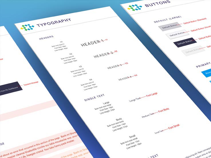
Sample Pages of Styleguide/Toolkit (I created all the initial visuals and design patterns)


I created spec deliverables & consistency guidelines (Headers).

I worked on color explorations & visual design breakdowns.

I created toolkit variable labels & unit measurements for handoff consistency.

RESPONSIBILITIES
- Research
- UI
- Visual Design
WHAT IS IT?
The Design System is a set of standards that encourages design patterns, styles and consistency across the platform. These reusable components established proper design guidelines and handoffs for designers to funnel back to developers, as well as help to improve communication. The Toolkit itself is essentially a “codified” version of the Styleguide, which are all encompassed within the Design System.
WHAT IS THE PROBLEM?
When I first started at Ten-X, I was the sole designer working on multiple sprint teams. Each time I handed off deliverables, I was submitting a lot of the same visual styles, guidelines and specs. This was becoming extremely redundant for both myself and the developers. This process was completely inefficient and took away time from the designer and developer to solve bigger, more complicated problems.
WHAT IS THE GOAL?
The goal was to create a more seamless process. To create an efficient system for consistency, guidelines and deliverables. That’s when myself, the lead front end developer and product analyst decided to create the Styleguide/Toolkit counsel. We saw a need for efficiency, and as a group of 3 individuals on our own time organically started the counsel. We started by designing and codifying typography styles, iconography, and units with clear specifications and guidelines. Over time, the guide expanded and had designated designers/engineers owning & covering a range of items such as:
- Colors
- Headers / Footers
- Typography
- Units & Grids
- Padding & Spacing
- Messaging
- Tables
- Iconography
- Buttons
- Lightbox & Tooltips
- Etc
CONCLUSION
Over the course of 4 years, the Styleguide/Toolkit has grown to be adopted across the entire product through all 3 lines of business. During this time, the counsel team members and styleguide/toolkit itself has grown exponentially. Consisting now of over 25+ members and it’s own sprints to stay on top of all incoming/outgoing updates and changes. It’s helped designers facilitate deliverables and mitigate UI and visual design problems, giving them a chance to focus on bigger issues for the business like user needs and customer experiences.