
FINAL PRODUCT
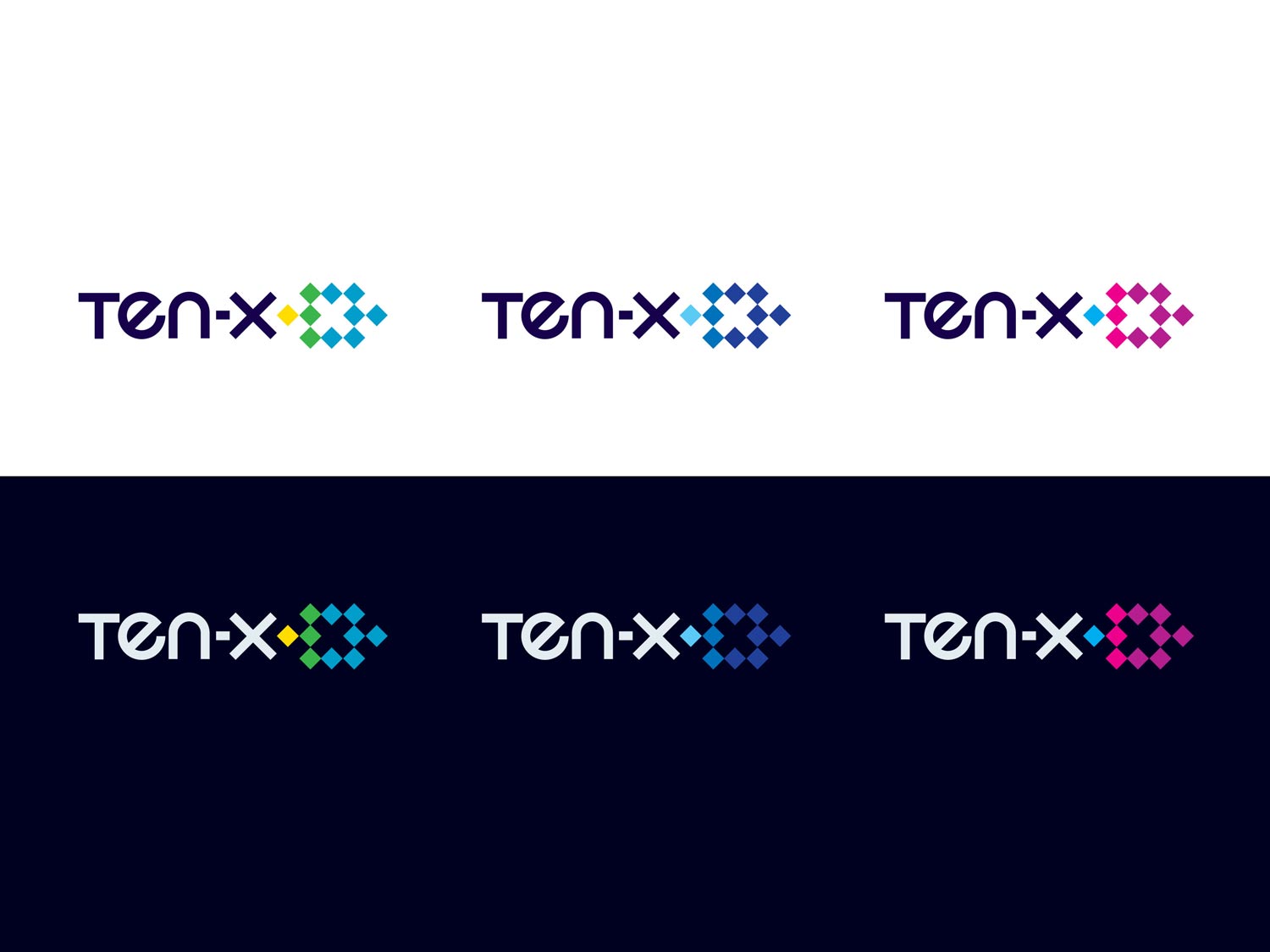
Final Branding Direction

Mood Board

I began creating various color explorations for the future product

I inserted the final visual directions into actual product pages like the homepage/landing.

I also applied the final visuals into multiple search results pages as well as responsive variations.


I created various use case explorations of the new navigation & interaction features.

I also did various high level potential future product pages explorations.

RESPONSIBILITIES
- Marketing
- UX
- UI
- Visual
WHAT IS THE PROBLEM?
Auction.com is a very successful online real estate platform with its closest competitor owning only about 8% of the marketshare. Auction.com was essentially broken down into 3 lines of business,
- Wholesale (foreclosure, bank owned, etc)
- Homes (consumer to consumer)
- Commercial (investors & consumers)
The major source of the company’s revenue and success has unequivocally been the Wholesale business. The wholesale business although profitable, brought along a major stigma; distress. During customer research session, approximately 75% of consumers associated Auction.com with key words such as bargain, cheap, budget, etc.
All 3 lines of business being all under one umbrella was problematic as their wholesale business dragged that stigma along to the other two lines of business (Commercial & Homes). With the efforts of our Chief Marketing Officer, Auction.com began a year long process of rebranding the business.
WHAT IS THE GOAL?
The goal was to break the single umbrella that held all 3 lines of business and give each business a chance to be a self sustaining individualistic product. It also was important to eliminate the stigma of bargain properties to be associated to commercial real estate product or consumer home product. It was important to change consumer perception of the business as they wanted sophistication and quality to be associated with the others lines.
WHAT IS THE CHALLENGE?
To speak honestly, this was one of the toughest projects I’d embarked on at Ten-X. I was tasked by the director of design to be the designer in charge of the product side of the rebranding. The CMO at the time was adamant about keeping everything in secrecy, even within the company itself. This meant that even within my own product and design team, I was told not to mention any of the process and even forced to sign a non disclosure agreement for entirety of the project.
The project started off bumpy as Marketing made no effort to bring Product into the process for feedback or concerns. The Marketing team hired an outside agency to do the company logo and colors. In the end, I was shown a deck and then handed some logos and font they wanted to use.
Problem was that everything they did for print & marketing did not translate over web & product. The colors were not good for accessibility (not readable on screen) and the font was not web safe (breaking across browsers). When I was able to give feedback, the Marketing team had to go back to the branding agencies and address all Product concerns. This was a very time consuming and an expensive mistake that could have been avoided through early communication and feedback.
WHAT IS THE PROCESS?
The process really had two silos. There was the technical process (how to convey to the developers) and actual visual design process (using marketing guidelines and visual design philosophies). Below I will describe both processes as simply as possible.
Process For Development
The process from the product design side was very meticulous. Myself and the lead front end developer worked closely together and gave a detailed outline to the director of design. A basic breakdown of the plan was as followed:
- Assess all current Styleguide & Toolkit components and making a list of all product pages that use Toolkit components. This includes going over all Page Building Blocks, Navigation, Container and Layout, etc.
- Assess every Auction.com Toolkit product pages to make sure that nothing is broken in the process.
- Loosely take a current product page (we used the Search Page for this exercise) with Toolkit components and break down which parts exist in the current Styleguide and what needs to be added.
At the end of this process, we wanted to have completed:
- A theming system for the Toolkit (one Toolkit for all 3 lines of business sharing all the same components and but with each line of business having its own visual/pattern guidelines or theme)
- An adjusted Auction.com theme based on the new theming system.
- A Ten-X theme based on the new theming system.
- A Search Results Page (the one product we chose as the test for delivering) wireframe that will convey to developers how to bring the bring the Search Results Page into the various themes we were creating using the Toolkit.
Process for Visual Design
The branding agency had given product a brand ethos (marketing elevator pitch) to give us a feel for the direction they wanted to head towards. I then had to translate this into a visual design philosophy to pass on to the design team. The key descriptive terms for the product visual direction were as followed:
- Sleek
- Refined
- Sharp
- Sophisticated
- Minimal
The visual design goals were:
- Maintain a clear Ten-X brand
- Have a clear distinction between the different Ten-X products
- Appeal to the key demographic and eliminate the stigma with Auction.com
The differentiators and decisions I was trying to re-solve during the visual design process was which direction was the new product efforts going to take.
- Light vs Dark?
- Dense vs Spacious?
- Familiar vs Progressive?
This process itself was very lean. There was multiple design feedback sessions with the design and product team as well as communication with key stakeholders (primarily C-Suite) for feedback about the direction the product was heading.
CONCLUSION
The re-branding itself from a technical point was a success. There were a lot of midnight hours the last 2 weeks (with free catered company dinners) but we were able to release the company rebrand successfully at the end Q1 2016. The CX (customer experience) team went back at the end of Q1 2017 to assimilate the now separate lines of business, and customer feedback was quite positive. Commercial Real Estate and Consumer Homes under the Ten-X umbrella product no longer carried the negative stigma associated with Auction.com and successfully distinguished the products from one another.