
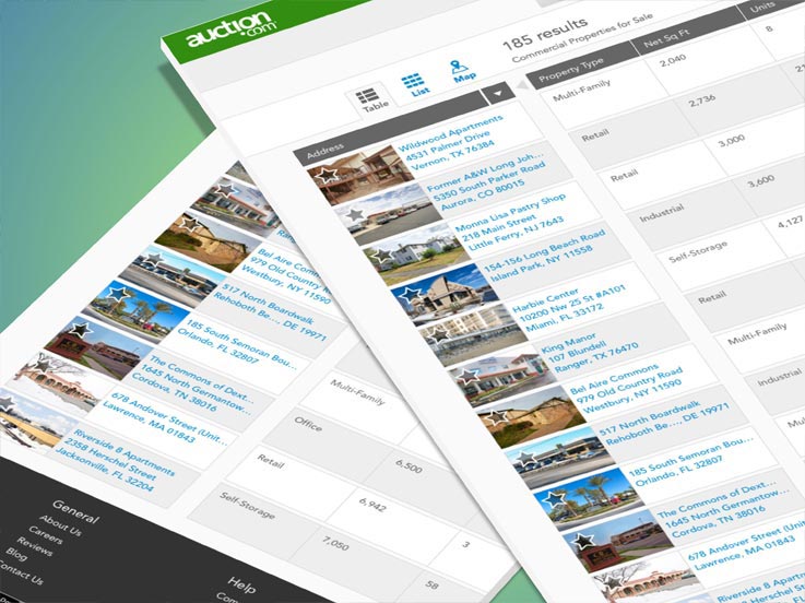
FINAL PRODUCT
Search Results Table View

I interviewed users and gathered notes of CRE user data consumption (i.e. Excel)

I began ideating & sketching variations of the table designs UX and interactions.

I created redline deliverables & handoffs for engineers to implement.

RESPONSIBILITIES
- Research
- UX
- UI
- Visual
WHAT IS IT?
The Table View within the Search Results Page is a product that derived based on customer behavior and user feedback. It is feature that was added to the Search Results Page well after the initial release of the list, grid and map views, which are all more typical views associated with search results.
WHAT IS THE PROBLEM?
The problem was that the initial Search Results Pages were initially designed for the residential and wholesale business. Its search behaviors fit that particular customer and user base. However, when dealing with the commercial business, the Commercial Real Estate users browse and absorb data very differently. As a result, we needed to cater an experience more adapted to the commercial real estate users. It was brought up to myself and my director by our Commercial Product Strategist at the time that we needed to design an optimized search result for these users.
WHAT IS THE CHALLENGE?
When we did you user research, we noticed that the commercial real estate investors were an older mentality group of users. Although the majority of them did own smart phones, they still did their primary searching on a desktop or laptop computer. They would often print out SRP (search result pages) and PDP (product detail pages) and copy and paste property information into excel spreadsheets. This was the way the majority of particular group absorbed the CRE (commercial real estate) data.
WHAT IS THE GOAL?
The goal is to aid the commercial users by helping them gather the information quickly and efficiently. We wanted users to be able to gather the information from the search results page they deemed necessary in order to be able to view multiple potential properties, without having to dig through the PDP for it. Based on user research we did prior to the designing the product, we observed and gathered feedback on how this particular user group browsed and absorbed data; It was important to help eliminate any bounce rate from the search results page.
WHAT IS THE PROCESS?
This product, from research to development, was done in about one quarter with a small team (all working on different products). We did not have any official sprints or stand ups, we all worked organically and self-accountably.
Sprint 1
- Worked with Product Strategist and Director to identify user pain points and understand bigger picture items
- Began work with the Customer Experience team to bring in users for user research feedback
Sprint 2
- Early wireframe designs with UX/UI concepts
- Prototyped wireframes in inVision and and tested internally for quick feedback
Sprint 3
- High fidelity designs
- Worked with prototyper (we had a front end prototyper at the time) for a fully interactive high fidelity interactive prototype
Sprint 4
- Test prototype with live users for feedback
- Gathered user feedback and begin design updates
- Worked with Toolkit team to begin additions of new components and patterns (tables & interactions)
Sprint 5
- Finish all final visuals and deliverables for Styleguide & Toolkit (to make all components ready for future designers and developers)
- Finish all redlines and deliverables for front end developer (work next to the developer to make myself accessible 100%) as development begins
Sprint 6
- Development continues (I remain assessable for feedback, guidelines, etc)
Sprint 7
- Ready for QA in our our dev testing environment
- Work with QA (remaining accessible for feedback, etc)
Sprint 8
- Product goes into production (watch closely for any minor or major bugs)
CONCLUSION
In the end, I designed a product that was intended to give the users the feel of their familiar spreadsheet, but with an efficient user experience and interface. We A/B tested the product and let 50% of the users have the table view as the default SRP landing experience, while still landing the other 50% of the users on the grid view but with a tooltip indicating that a new view was available. After several months, 92% (source: omniture) of the commercial users preferred and browsed in the Table View. The product was deemed very successful by the business and the small team received internal recognition for taking initiative and identifying a hole in the product. It was done quickly and inexpensively. I would deem this particular product feature successful as it was 1) one of the early passion products by a few motivated individuals 2) and was officially flipped over as the default Search Results Page view after a few months of testing.