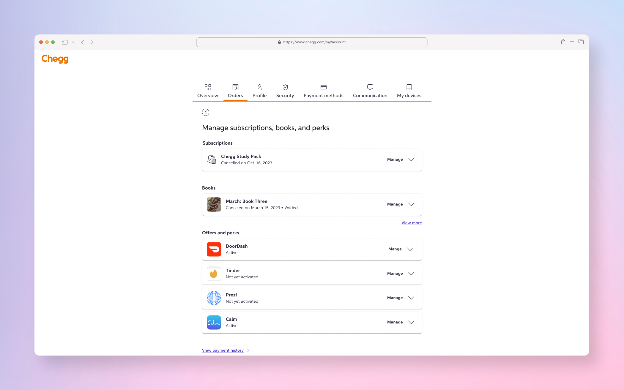
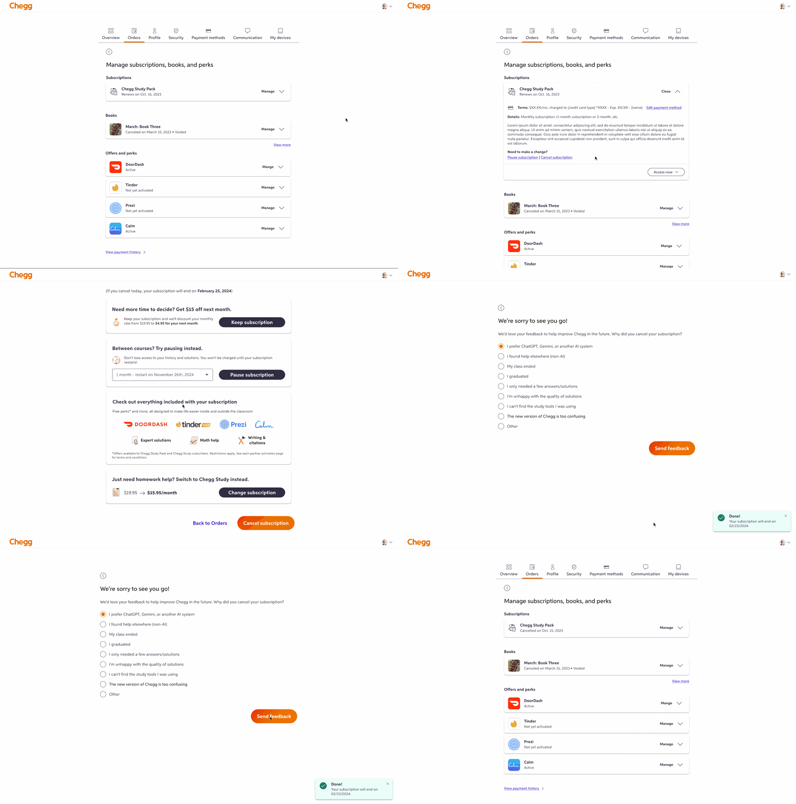
FINAL PRODUCT
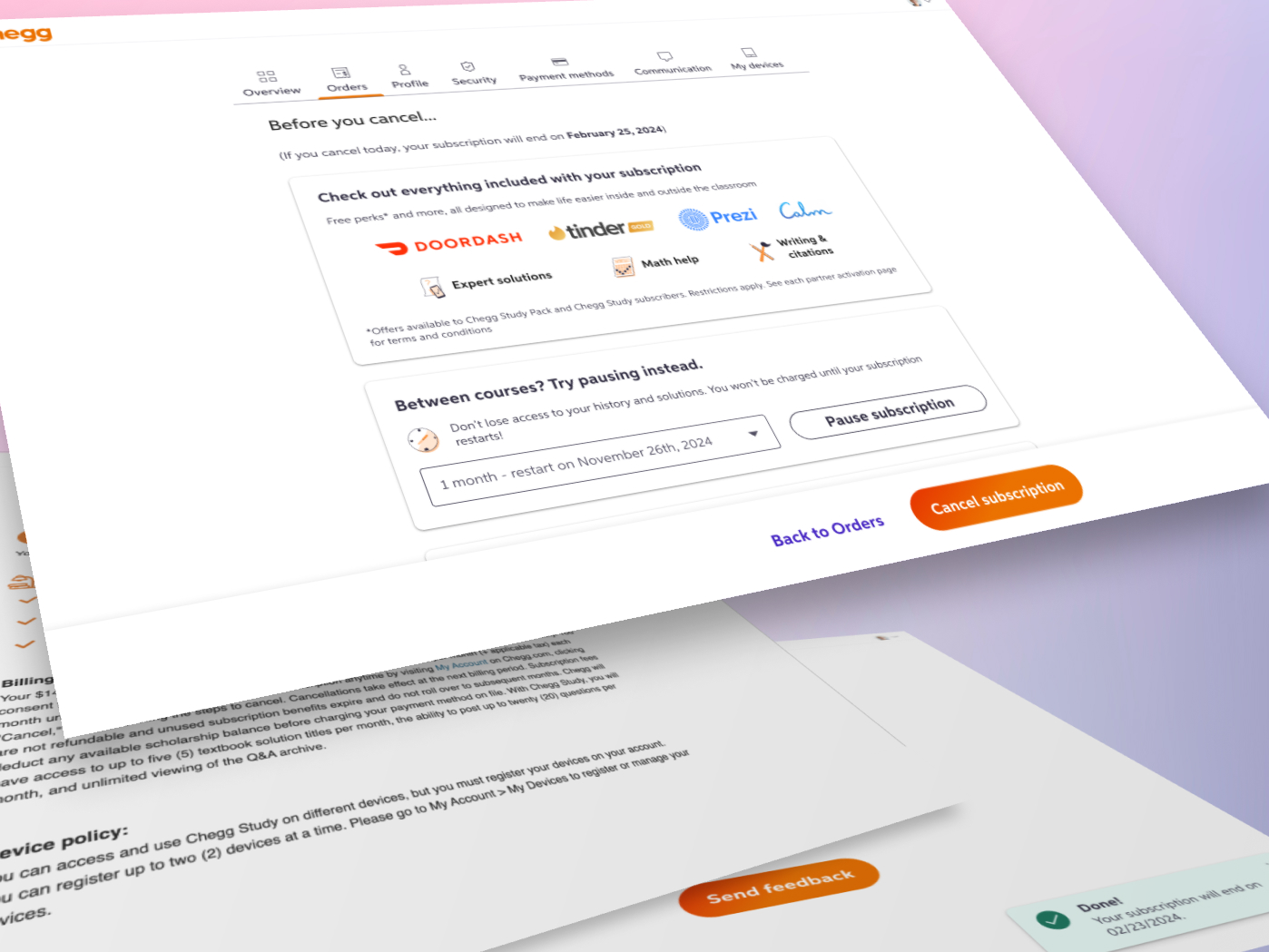
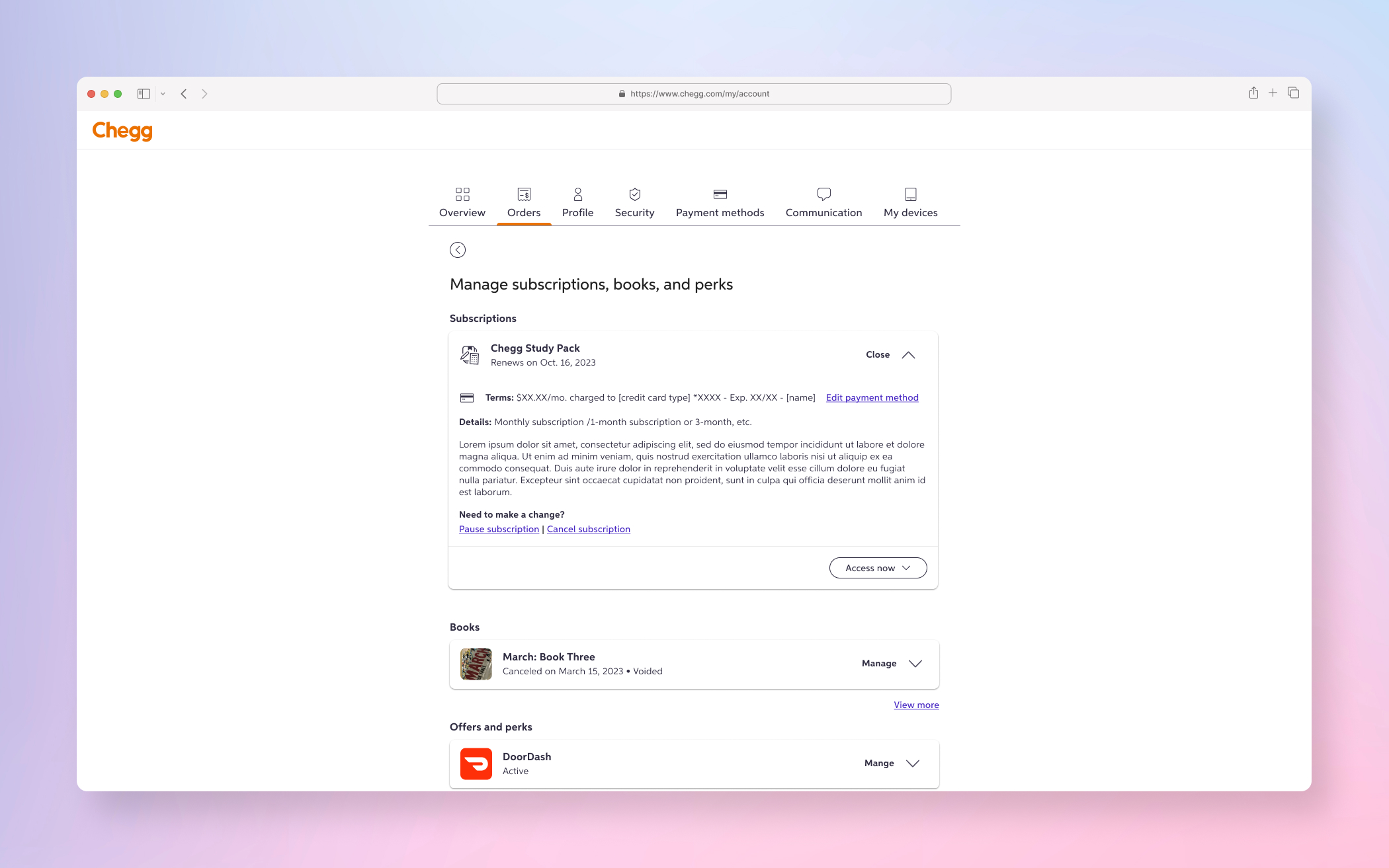
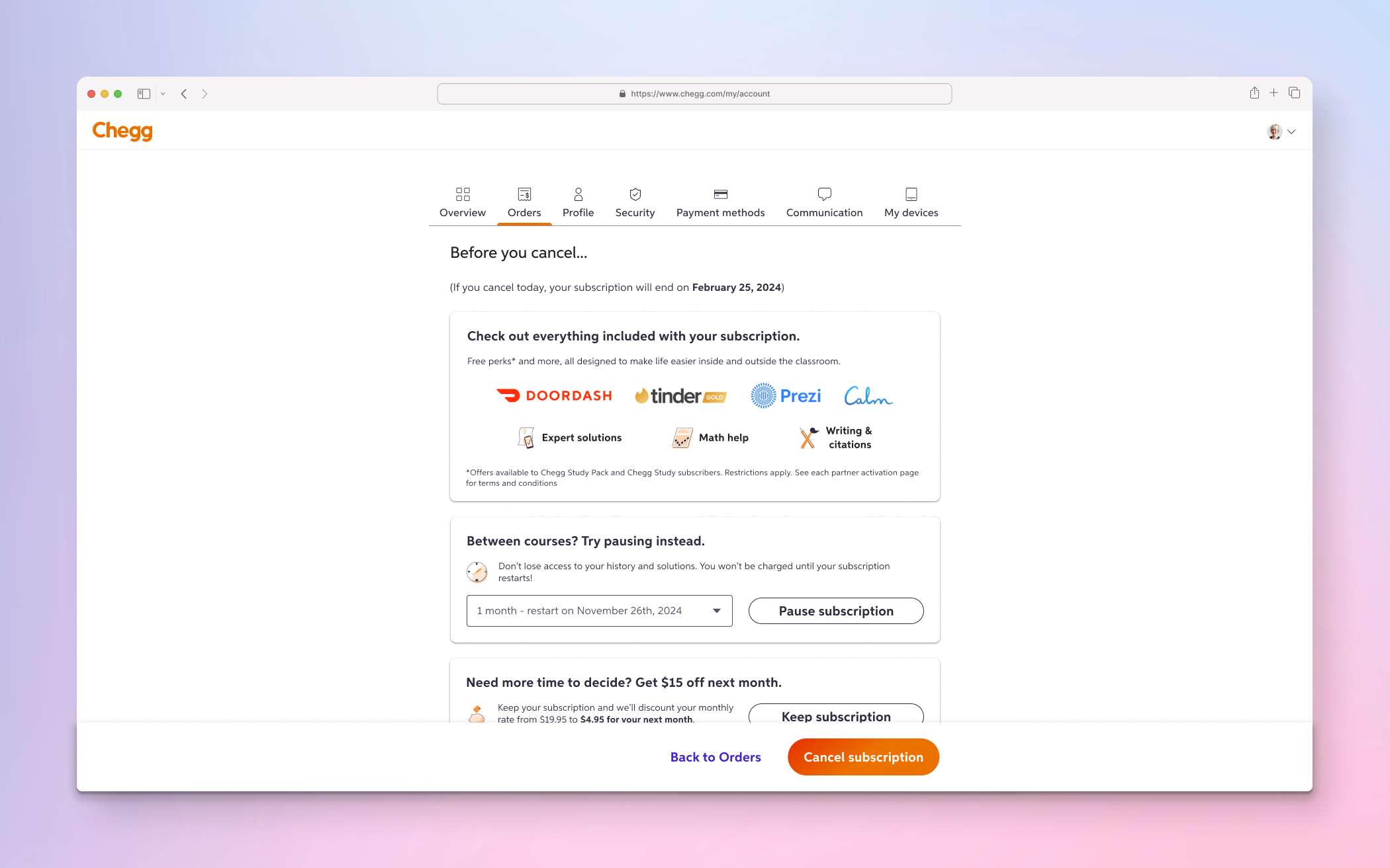
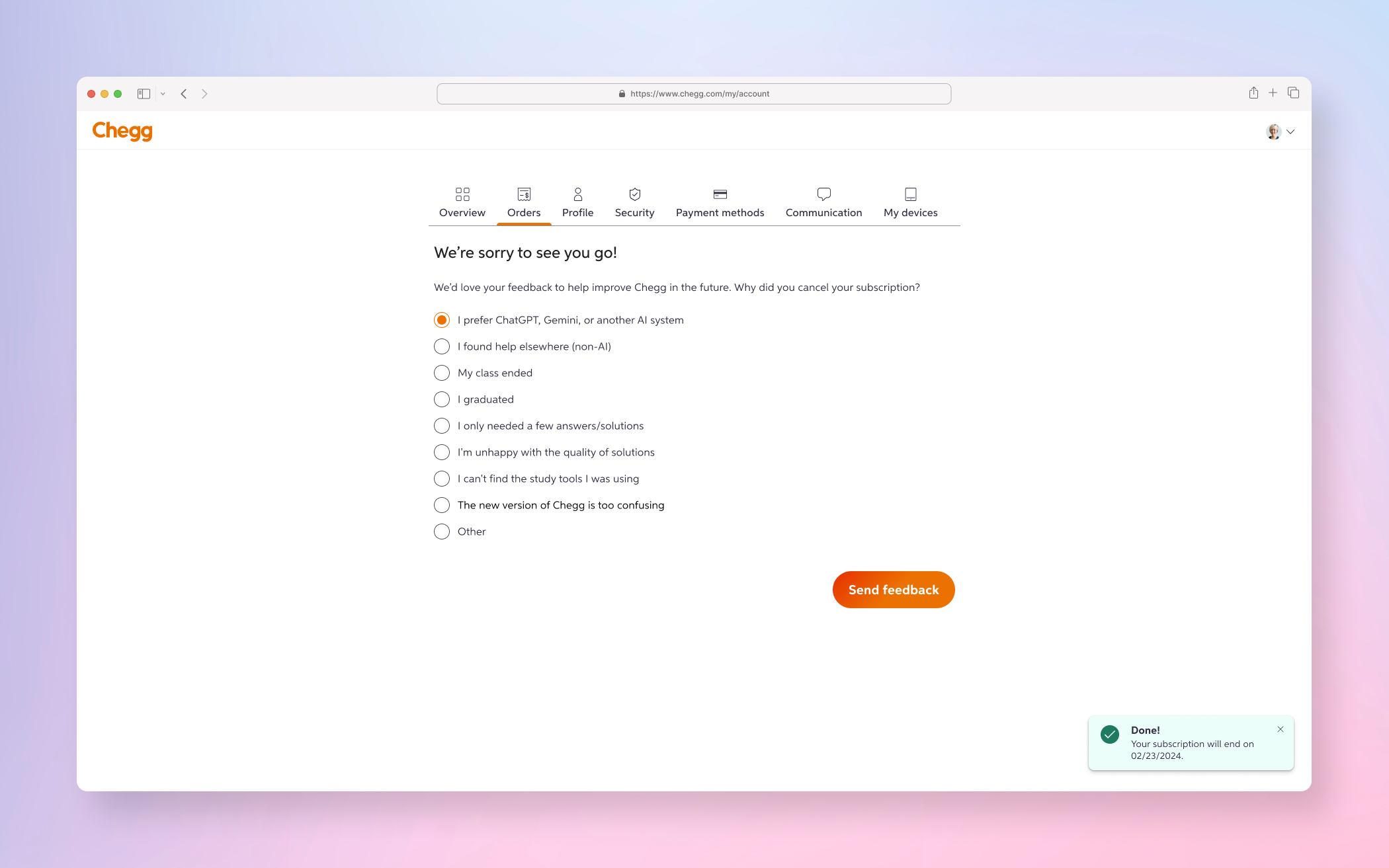
A few examples screens of the final Cancellation Flow designs
DISCOVERY PHASE
The first step of the Discovery Phase was the understanding and gathering process which began with quantitative data deep dive of all data (niche journeys, revenues streams, flowchart breakdowns), qualitative interviews, product analysis with SMEs, documentation of current state and competitive analysis
Quantitative Data (I did a very deep dive into the quant data to understand the exact impact to the business in terms of revenue through data dashboards, analytics breakdown and SME interviews and syncs)
↓
Documenting of current state (collected all the current patterns and entry points related to subscription cancellations)
↓
Competitive Analysis (Completed an analysis of other products solving similar problems to strike a balance between necessities and constraints )
↓
IDEATE PHASE
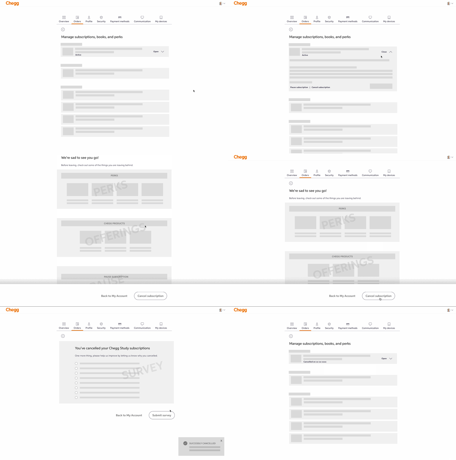
For the ideation phase of Cancellation Flow, I went through rapid iterations and feedback cycles with wireframes, high fidelity designs and prototypes
Wireframes After the discovery phase, I fully understood the highest retention levers and potential revenue per user we’d be losing. I formed a design hypotheses and created wireframes and prototype for rapid feedback.
↓
High Fidelity (following wireframes and prototypes, I created multiple high fidelity designs variants along with prototypes here as well. This also included revisions after team, stakeholders, legal & leadership feedback sessions)
↓
Early Signal Testing (After I felt comfortable from all the iterations based on product team, stakeholder and legal feedback, I put the high fidelity prototype on usertesting.com to validate comprehension, discoverability and task completion)
↓
REFINE PHASE
After refining the design based on the early signal testing, I then finalized the designs and presented and did the final share out with both the legal team and then the leadership. This project was very high visibility due to compliance and had more check-ins than typical.
Internal Feedback (final stakeholder, legal and leadership. Async feedback was done through Figjam and final walkthroughs were done in person)
↓
RESPONSIBILITIES
- Research (early signal testing)
- UX
- UI
- Interaction
WHAT IS IT?
Years prior to my employment at Chegg, the company had “intentionally” designed a very nefarious flow which included many steps with no clear path or messaging for success in terms of cancelling their subscription. This would cause users who have meant to cancel, to not actually have cancelled their subscriptions as well as a giant influx of customer service calls during peak seasons.
WHAT IS THE PROBLEM?
This dark pattern was intentionally done years prior in order to use cancellation flow as a retention lever. The higher friction during the cancel flow while also showing the users many perks or reasons to not cancel would be laborious and often cause drop-off during cancelling. Thus, retaining a customer who would continue to subscribe (even if they did not intentionally wanted to remain so). This friction was noted by the leadership and legal team when federal and state regulations stepped in and required a “1-friction point max” cancellation by a specific date or face hefty fines.
WHAT IS THE CHALLENGE?
There were many challenges with this project but the two most glaring problems were:
- Immovable clear time line constraints and deadlines based on federal and state regulations
- Immense hefty fines for the company if these demands were not met
Along with the bigger two glaring challenges listed above, there were also smaller side challenges for me personally that also proved to be restrictive. These included,
- Being brought in days before the project ideation was set to begin
- New manager that had no familiarity with the platform and also was not part of any of the initial discussions
- Product & business came up with an execution plan with no design input and locked it for design deliverables (no formal kick-off)
WHAT IS THE GOAL?
- The user need is to provide a clear path to cancelling accounts and to have no more than a 1-friction point flow
- The business goal is to meet federal & state compliance regulations before the due date to avoid hefty fines
WHAT IS OUR METRIC FOR SUCCESS?
The business and product had a two part plan as to how they were going to measure success, those being:
1. Increase the cancellation completion rate close to 100% as possible for those who intentionally started and intended to cancel (as of today cancel completion rates were closer to 70%) which would then cause a huge influx of customer service calls requiring help for cancellation of subscriptions with a phone rep. This is clearly problematic as:
- Each call to customer service cost Chegg approximately $6 dollars
- This heavy incursion would happen during peak season times for something that could be fixed with UX on the product itself
2. Begin plan about the retention levers and where they could be applied for the definitive drop in retention and revenue (although it was a smaller number in comparison to other products, the cancellation flow was a way to retain revenue with existing users)
WHAT IS THE PROCESS?
Due to the constraints listed above with the challenges, this project was very fast moving with discovery, rapid design iterations and team/stakeholder feedback along with prototypes and early signal research testing. Specifically, the project was broken into my normal discovery, ideation and refine process.
Discovery Phase
- 1 week for understanding and gathering of discovery (quant data, defining problem space, identifying goals and metrics, etc)
Ideation Phase
- 1 week for ideation of low fidelity, high fidelity, prototypes, early signal research testing with users
Refine Phase
- 1 week for final stakeholders and legal and compliance finalization
CONCLUSION
During the process of the discovery phase, I realized quickly that I did not agree with the metrics set by the product team (hence, why it’s important to have a designer in the discussions and proper kick-off). I formed a design hypotheses that we could combine the metrics for success in a v1, rather than having it as a separate goal. I designed a wireframe variant, pulled my PM and lead engineer into a room to show my hypotheses but also to verify any of the constraints or dependencies.
After confirming we both PM and engineering that it was plausible, I approached the VP of customer service and head of operations. After showing them a wireframe prototype about being able to solve two problems in one MVP, both agreed with my hypotheses and I was able to move forward with these design variants. This allowed the team to create an A/B test and do a measured roll-out to make sure we weren’t harming the product.
Product Data Metrics
- Cancellation completion rate in the test cell was 98.4% (versus 78.9% for the control cell in the old designs)
- Retention Lever Rates (pausing) increased by +9.2% in the test cell, indicating that users were now aware of pausing subs (meaning business retained the active paying subscriber)
- Customer service contact rates dropped by –10.8% in the test cell (again, each call to customer service cost Chegg approximately $6)
