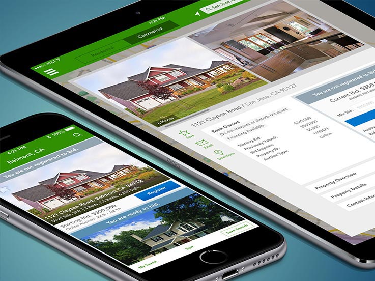
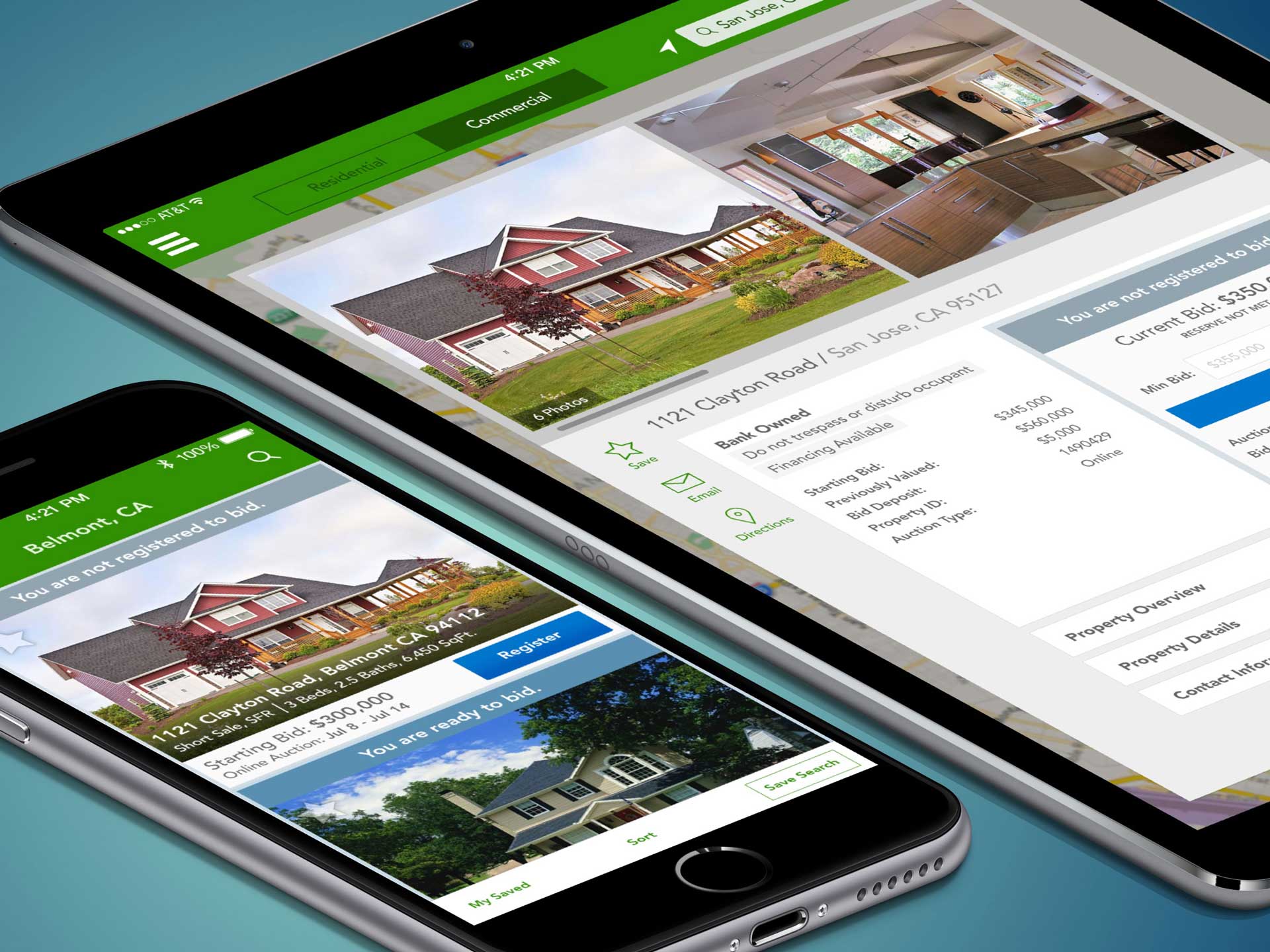
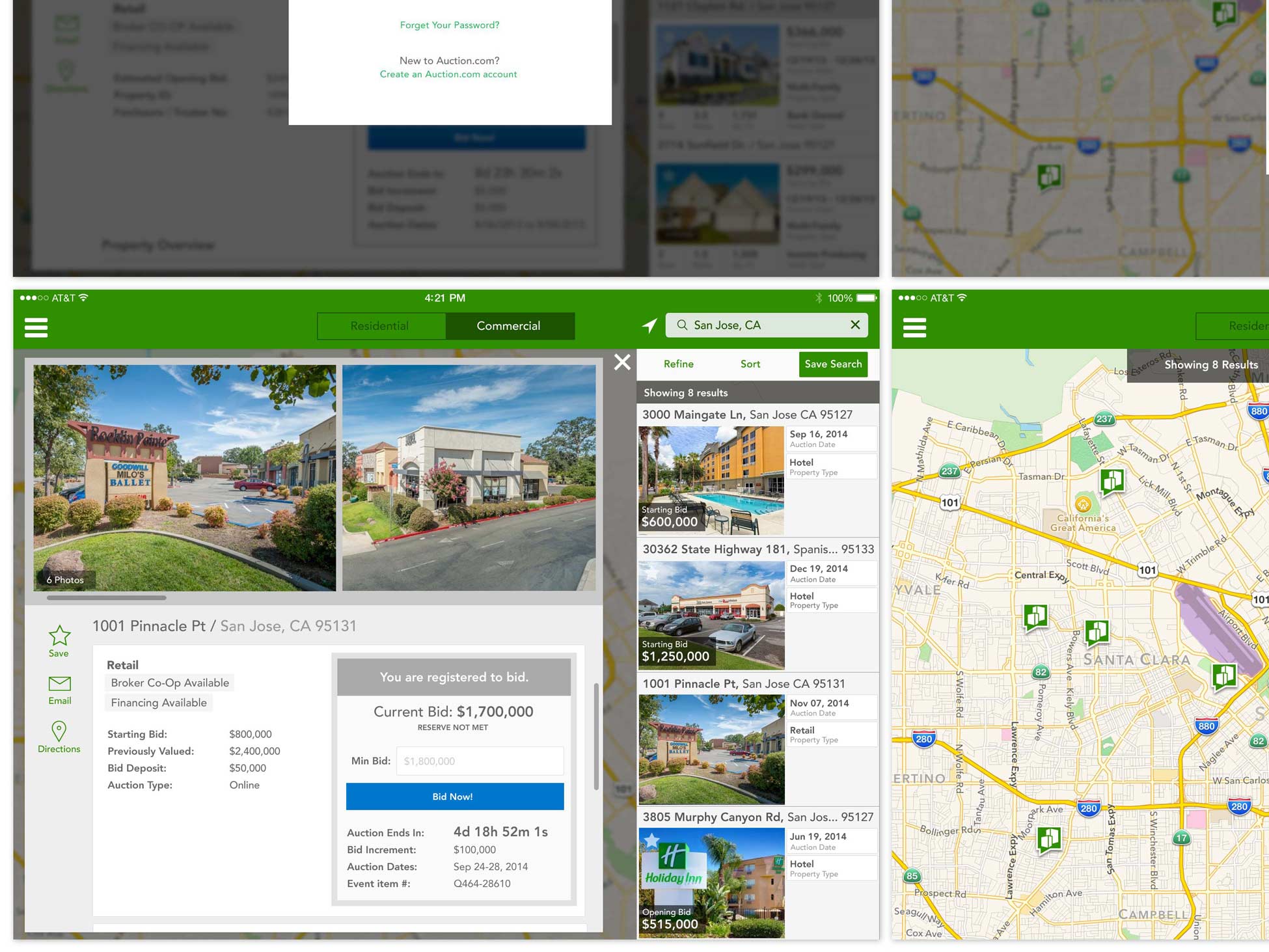
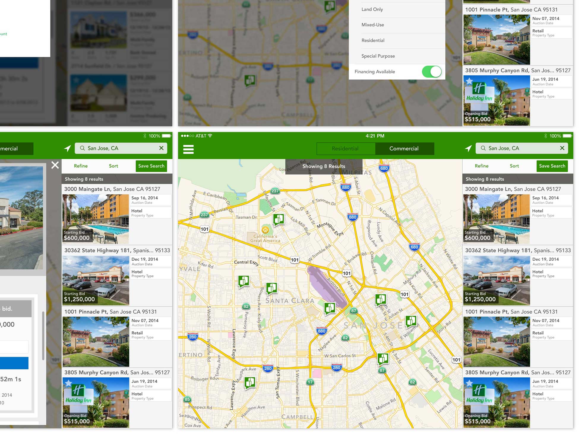
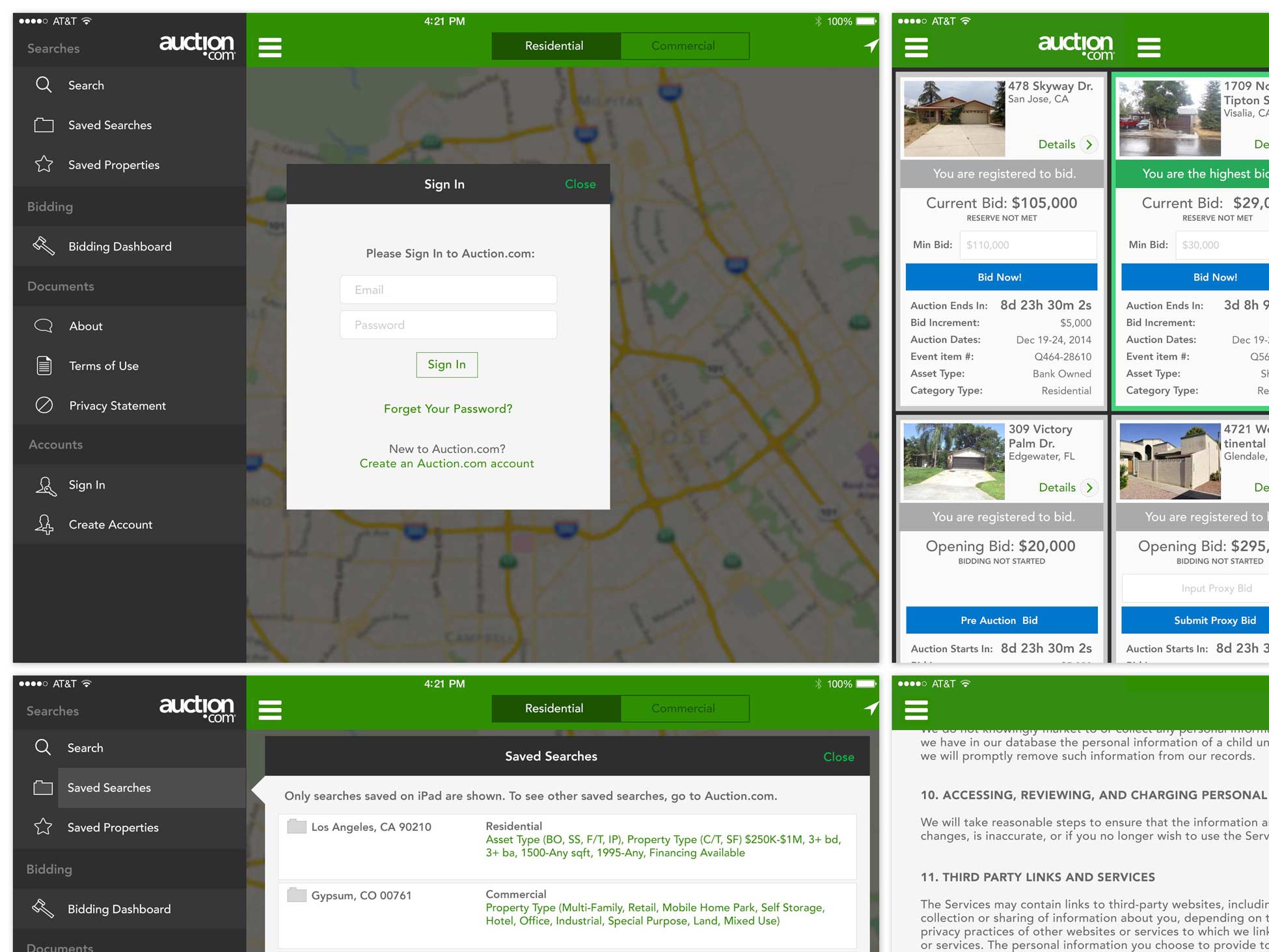
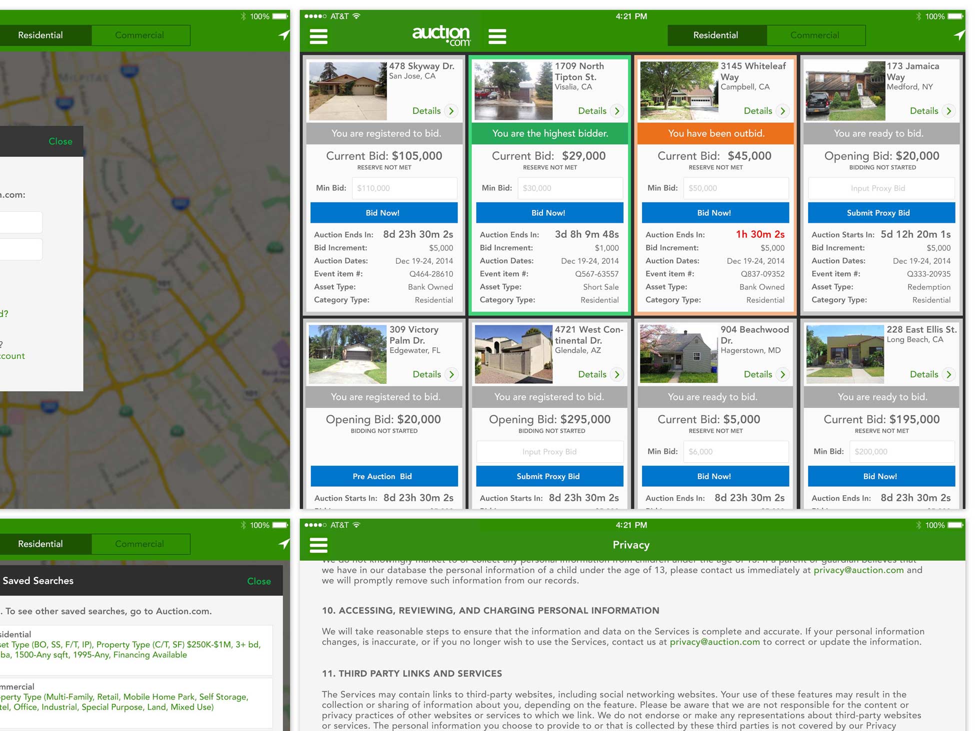
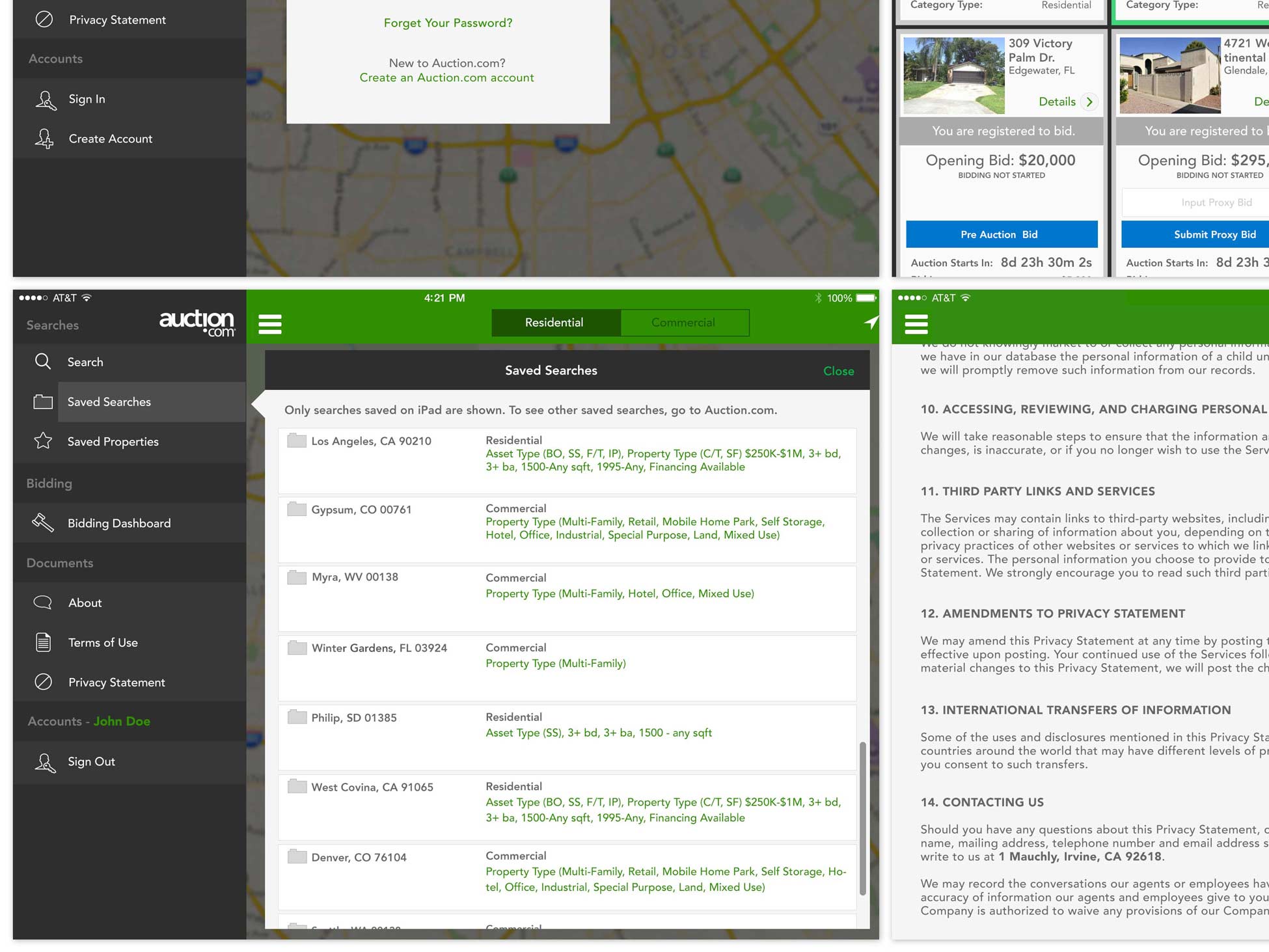
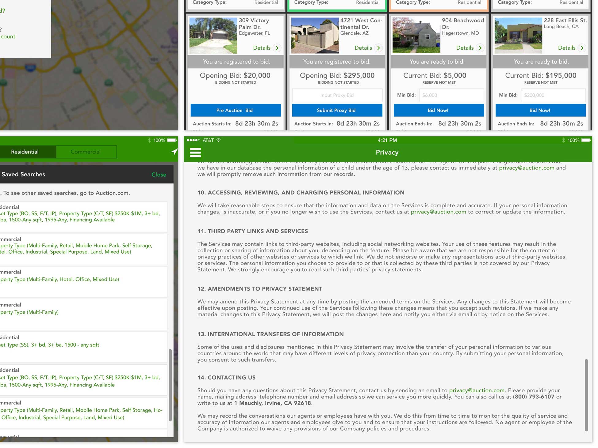
FINAL PRODUCT
iPhone & iPad iOS Auction.com Apps
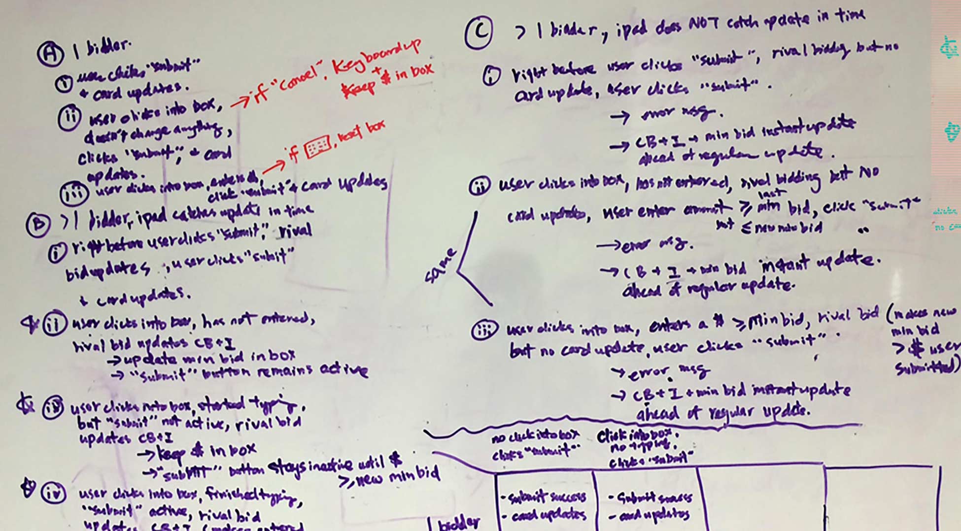
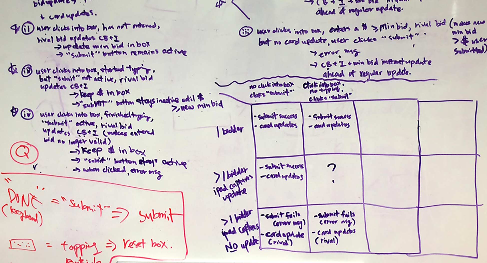
I began by whiteboarding user journeys, needs, goals and constraints with my PM.
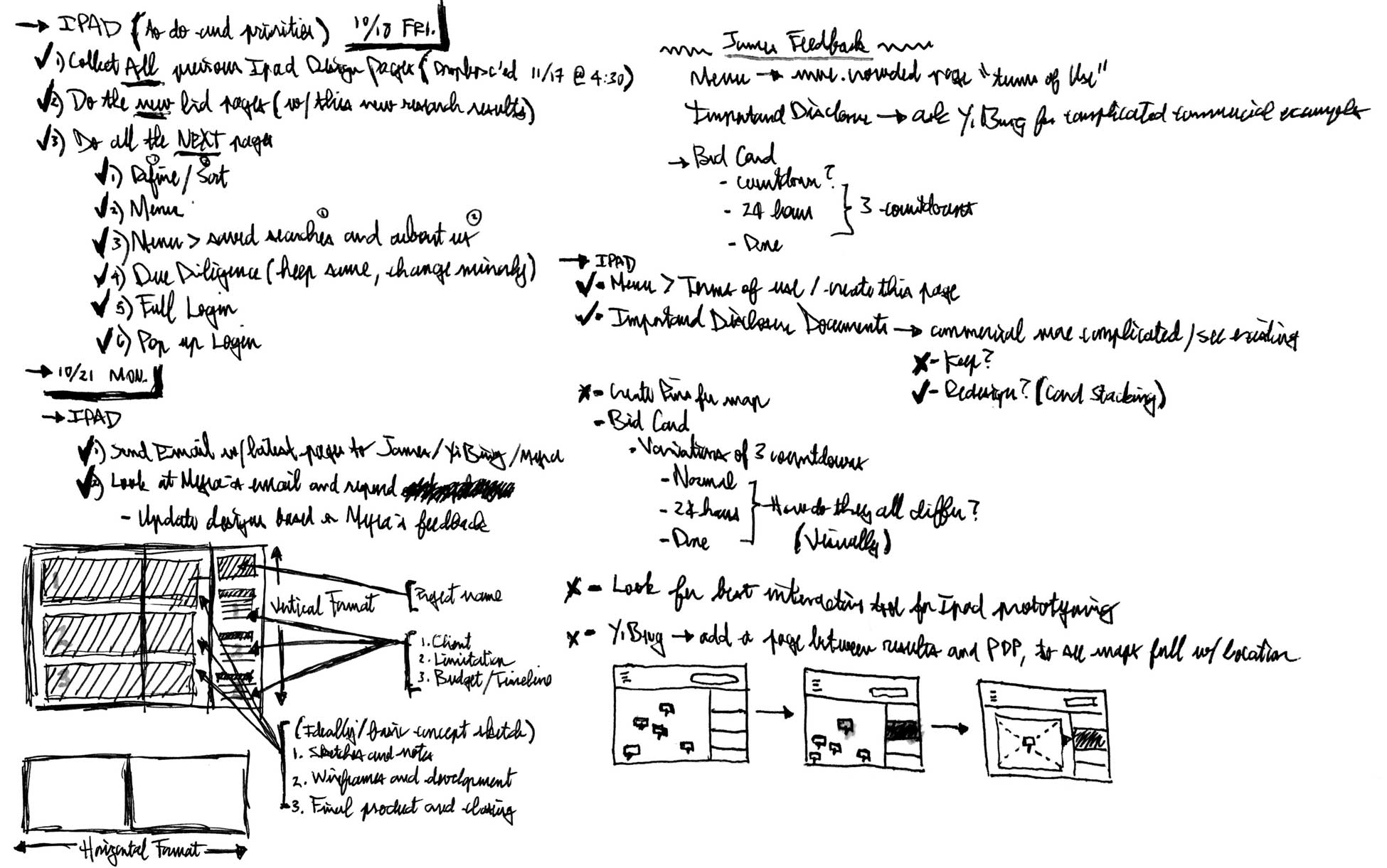
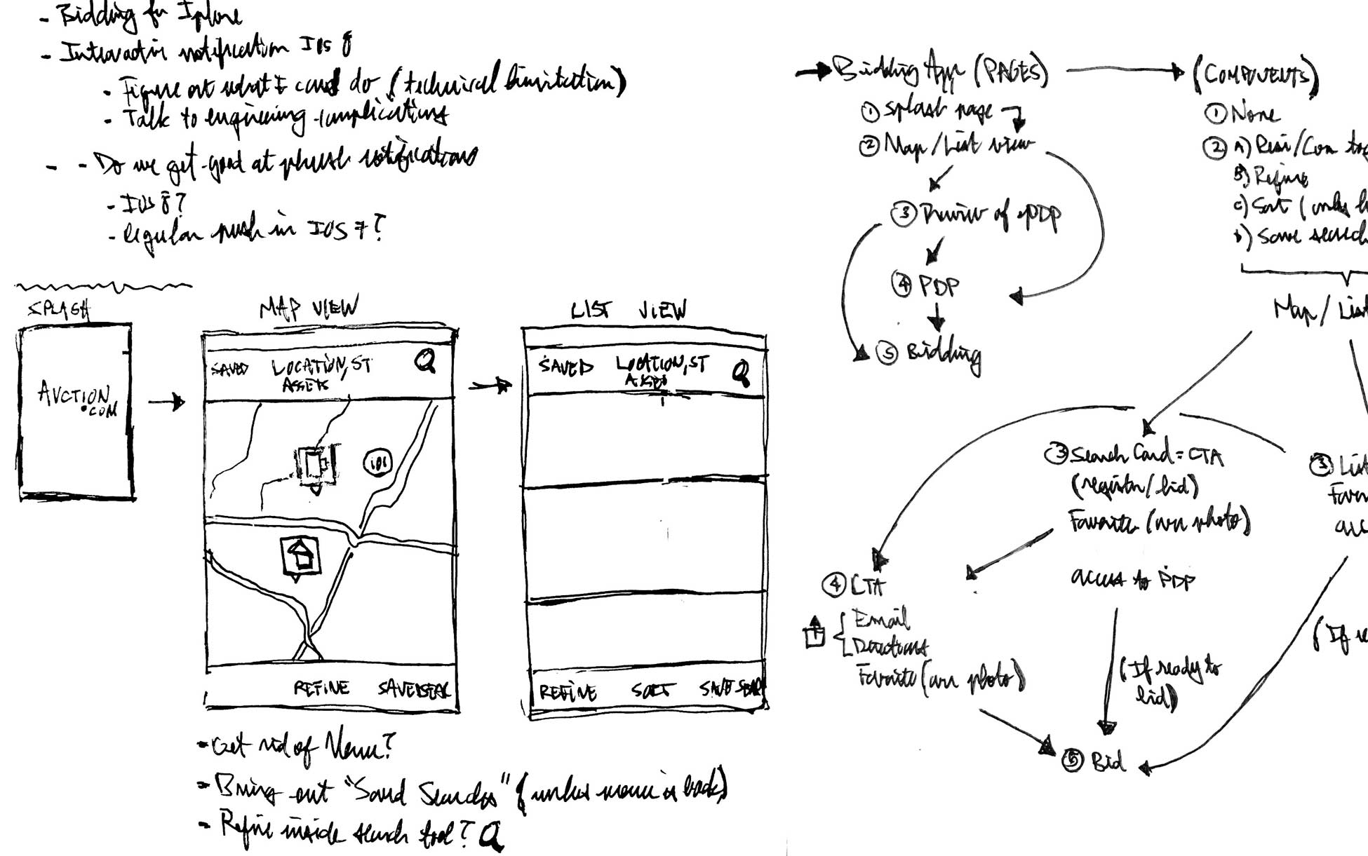
I sketched and ideated notes, assumptions & sketched early UX/UIs.
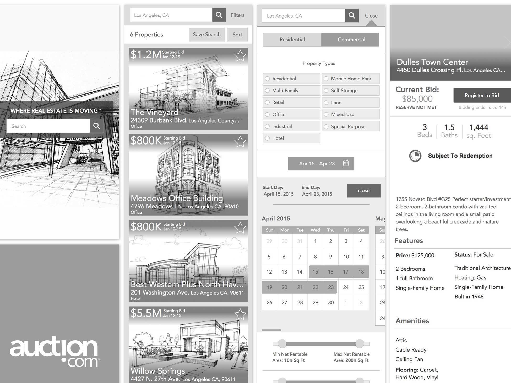
I created various static visuals wireframes & shared it with the team.
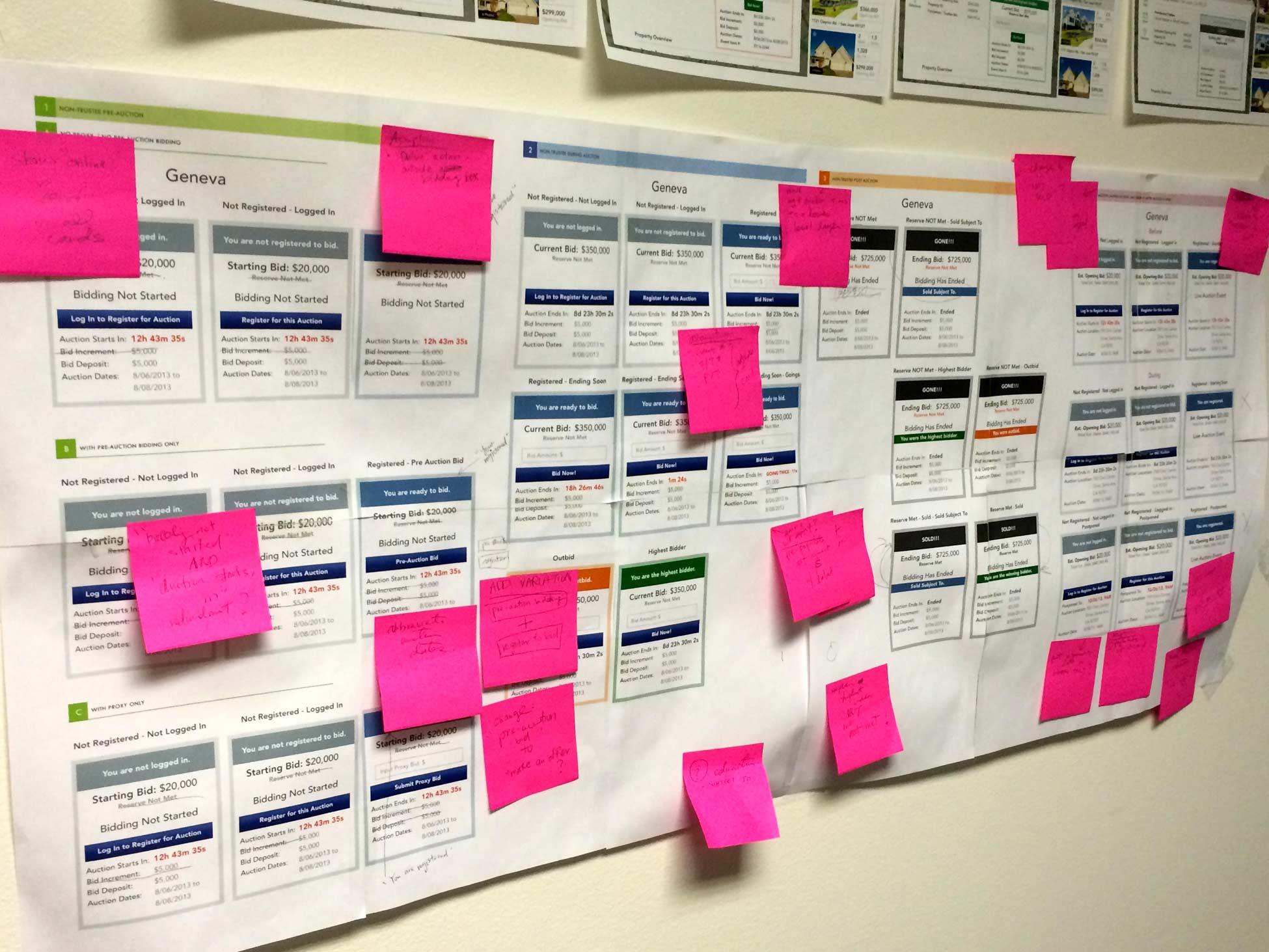
I gathered team feedback, and revised bidding logic, visuals, etc.
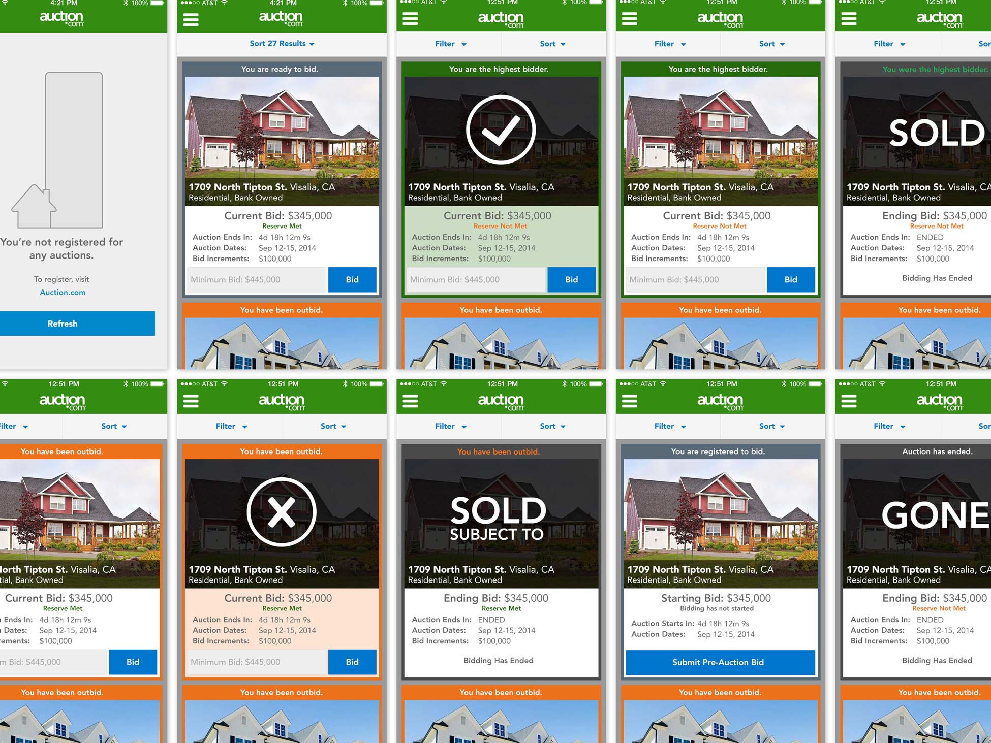
I created the high fidelity visual designs (iPhone dashboard variations)
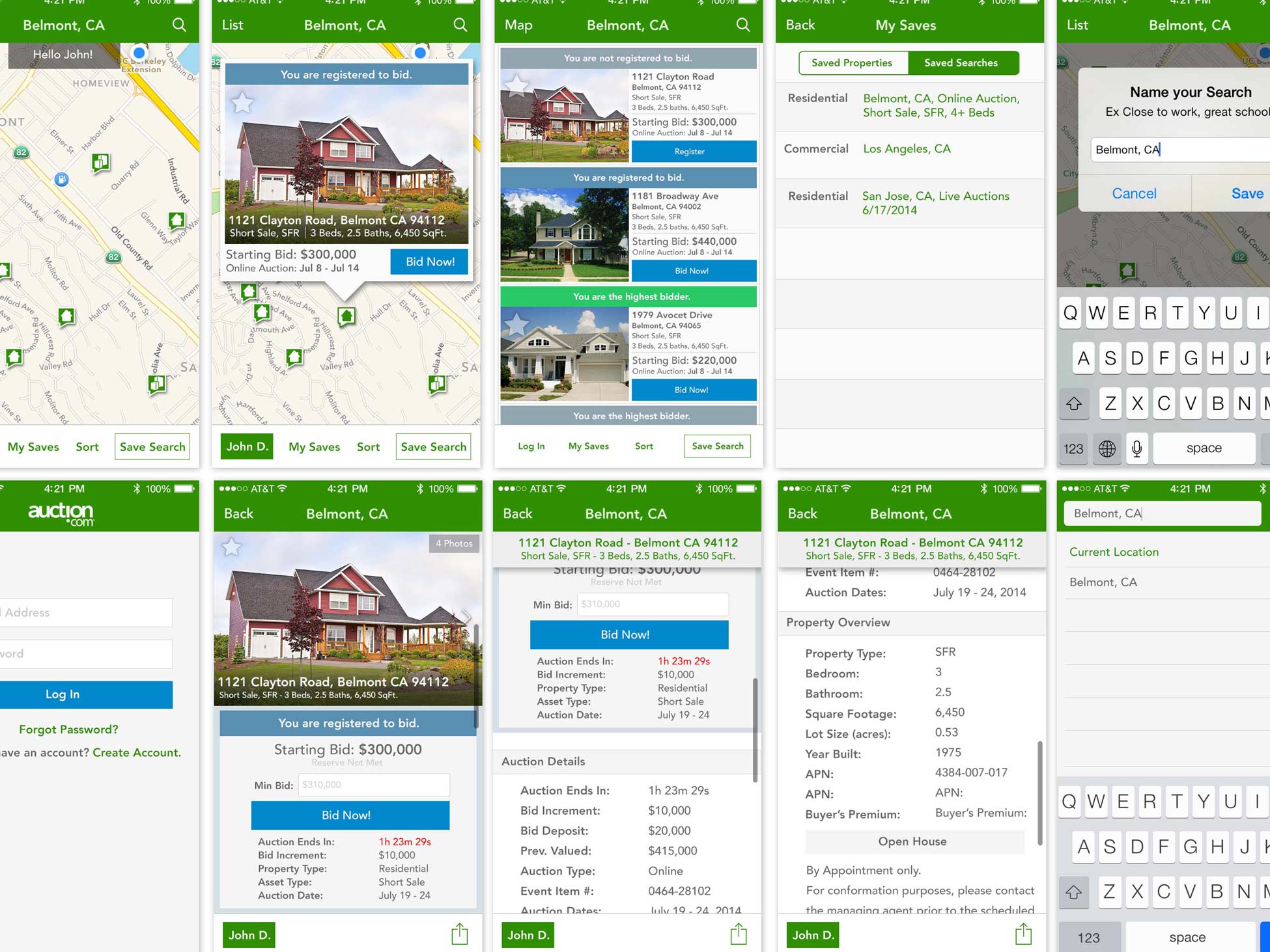
I created high fidelity visual designs (iPhone SRP, PDP & bidding variations)
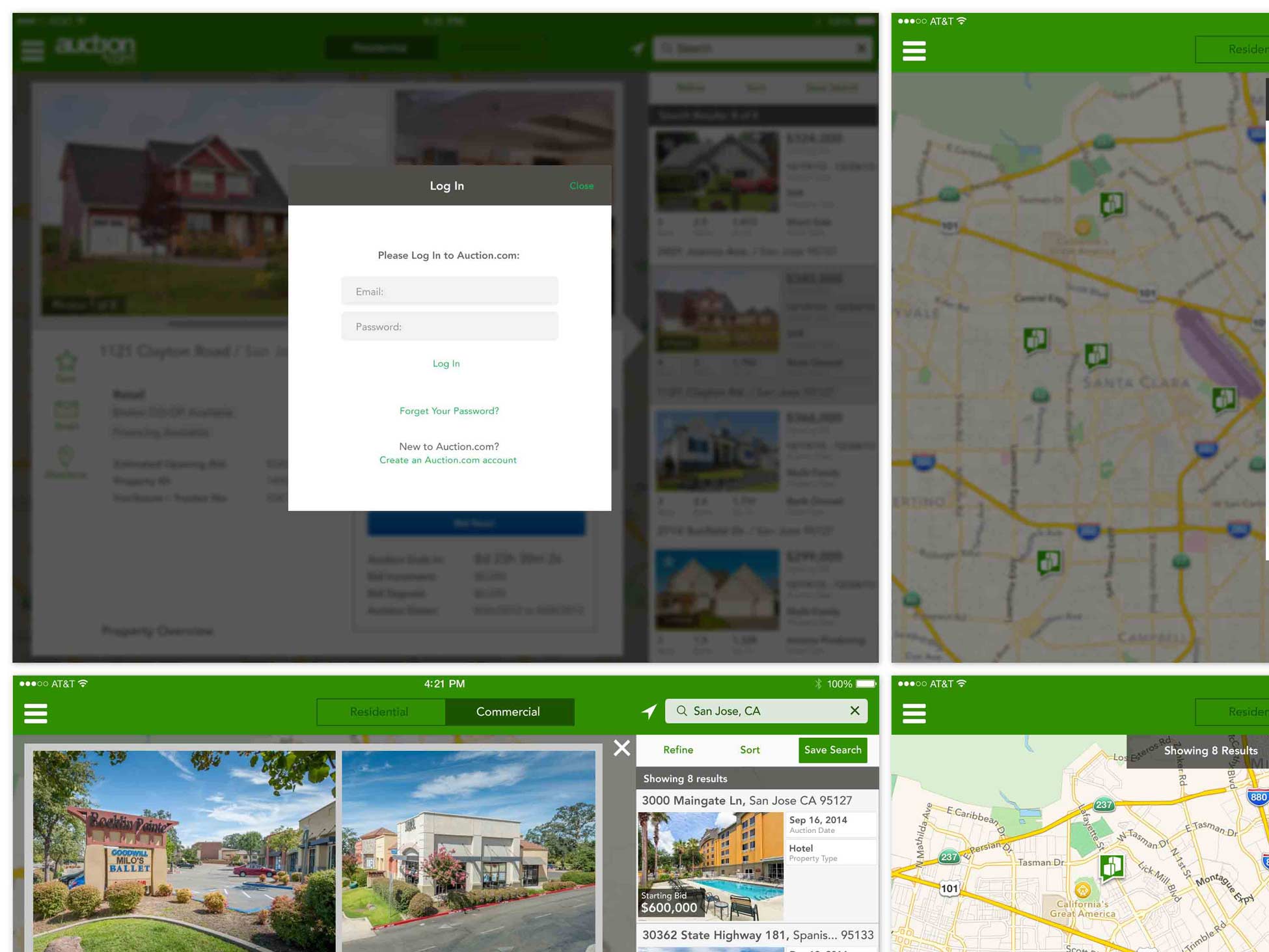
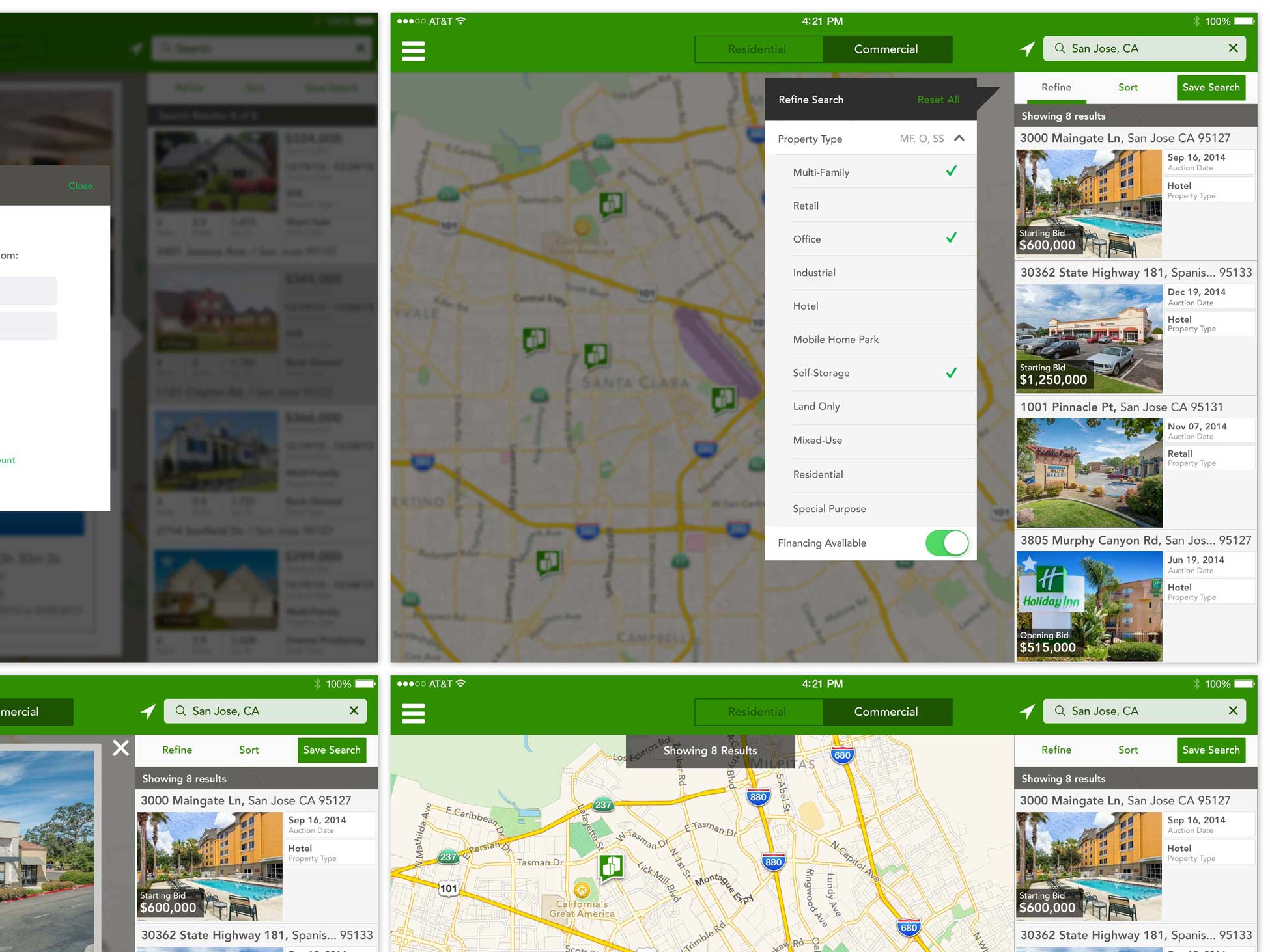
I also created the final high fidelity visual designs for the iPad.
RESPONSIBILITIES
- UI
- UX
- Visual
WHAT IS IT?
The Auction.com mobile IOS apps.
WHAT IS THE PROBLEM?
At this juncture if Auction.com, the company had a successful online presence without a mobile phone product. The business had an iPad app that had gone out on beta and developed a little bit of traction, but no iPhone app. The metrics for the mobile web on the iPhone showed usage trending upwards month after month. As a product team, this led us to begin the process of building an official iOS mobile app that would serve both iPhone and iPad.
WHAT IS THE GOAL?
The longterm vision and goal was to have users be able to bid, browse and win properties on a portable handheld device. The short term goal was to release an MVP product to get into user hands in order to measure and learn quickly from user behaviors.
WHAT IS THE CHALLENGE?
There were two major challenges right off the bat for the mobile iOS app.
1) Lack of Resources
- At the time we had a very small team, one Product Manager, one Developer and one Designer (myself). Auction.com was in its product infancy (the product team itself was less than a year old when I joined). We definitely lacked resources and the business still considered venturing into mobile, at the time, to be futile.
2) Design Methodologies
- The biggest change in terms of UX and UI was leaving skeuomorphism and entering more traditional modern design methodologies. This added more challenges as our user personas showed an older user base who were not fond of big changes. On top of all this, another challenge was having to learn update myself with the new visual, patterns and processes of the evolving iOS designs.
WHAT IS THE PROCESS?
This was one of my first major products at Ten-X and I was fortunate enough to work with a very strong Product Manager. She handled all the business and stakeholder challenges so I as able to focus more on design problems (UX, UI and visual designs). We broke down the the design process as such,
UX (User Experience)
- The PM and I locked ourselves in a room for several hours and essentially worked on the discovery phase. We went straight to whiteboarding and breaking down the current iOS 6 app. We discussed how much could be salvaged (it wasn’t using the same code base at the moment and was coded by a contractor that had since left). The biggest factor being the current iOS 6 iPad app was ONLY a browsing app, it did not allow bidding. We discussed technical use case scenarios that could happen (how the API would handle multiple mobile bids if the behavior didn’t exist for the desktop etc). We broke things down using matrixes and began a rough idea of what we expected, and how robust the experience could or should be for the first release. During this time, I also spent a lot of my work and personal time catching up with Apple’s pre flat design developer guideline and documentation.
UI (User Interface)
- After the discovery phase, I began to sketch many user interfaces based on our UX discussions. I did a couple of wireframes and presented to my PM. We worked through all of them and edited designs till we felt the product was moving in the right direction. I then created high fidelity designs and prototype for us to test internally. After a last round of internal feedback, I began the final flat design visual designs for handoffs.
Visuals (final assets and deliverables for development)
- This is the only part of the design process that I spent in my own “bubble” making sure all redline details were correct, especially regarding grids and adaptive sizes (responsive design was not even something in our scope). During this implementation phase, I worked closely with the developer to make sure that there were no issues with my handoffs and that I’d be completely available for any questions or feedback he had regarding the user experience, user interface or final visual designs.
CONCLUSION
Amazingly, the iOS product launched within a very tight time frame and deadline. Since the release of the initial iOS7 app, the Auction.com mobile app has grown tremendously. Mobile has continued to trend upwards and as of January 2017, handled close to 35% of Auction.com’s bids. The mobile team itself has grown tremendously, with now 3 separate mobile teams (Residential, Commercial and Wholesale) all consisting of their own PMs, designers, and several developers each.

