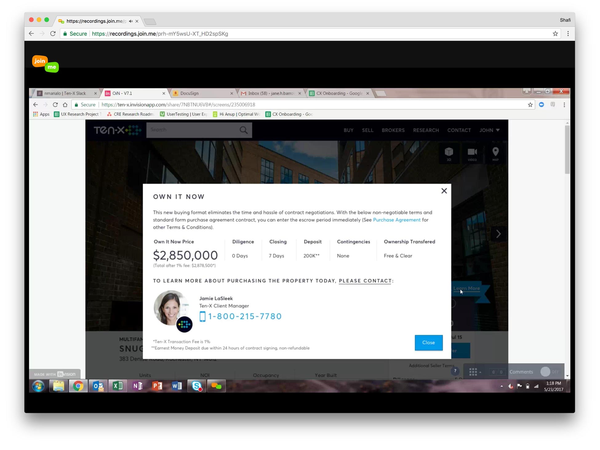
FINAL PRODUCT
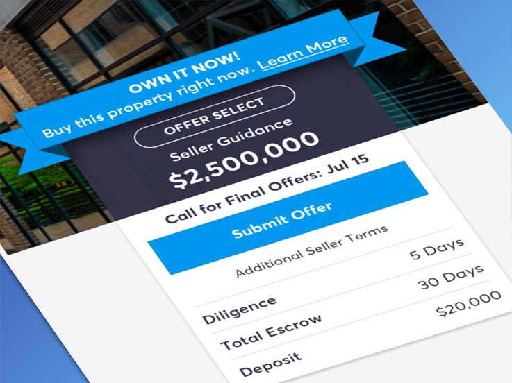
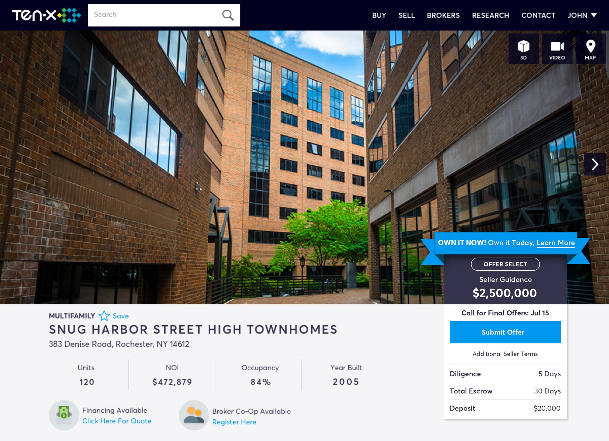
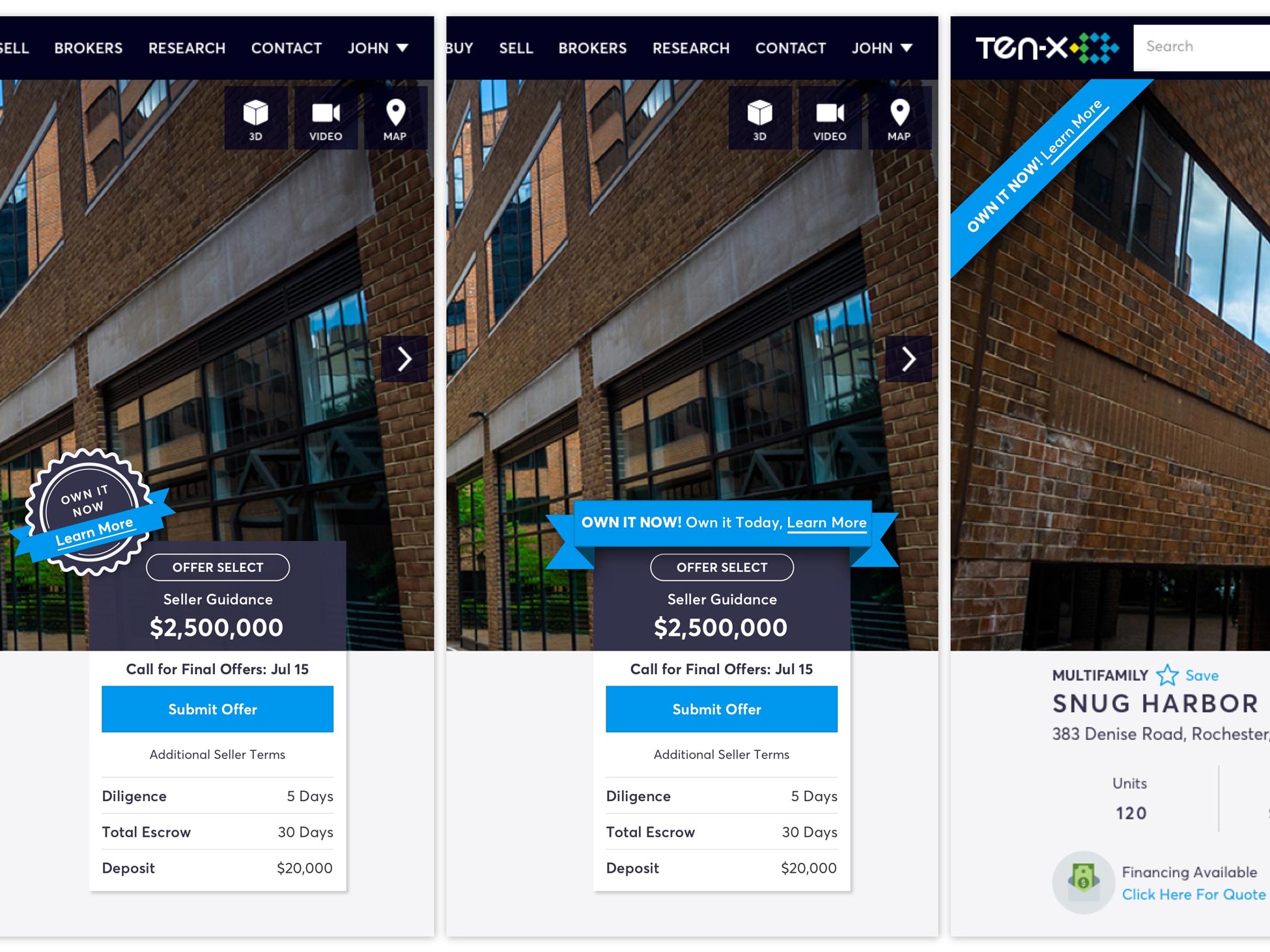
Product Detail Page | Own-It-Now Feature
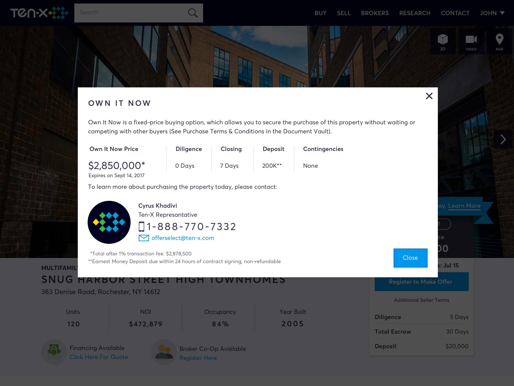
Product Detail Page | Own-It-Now Lightbox
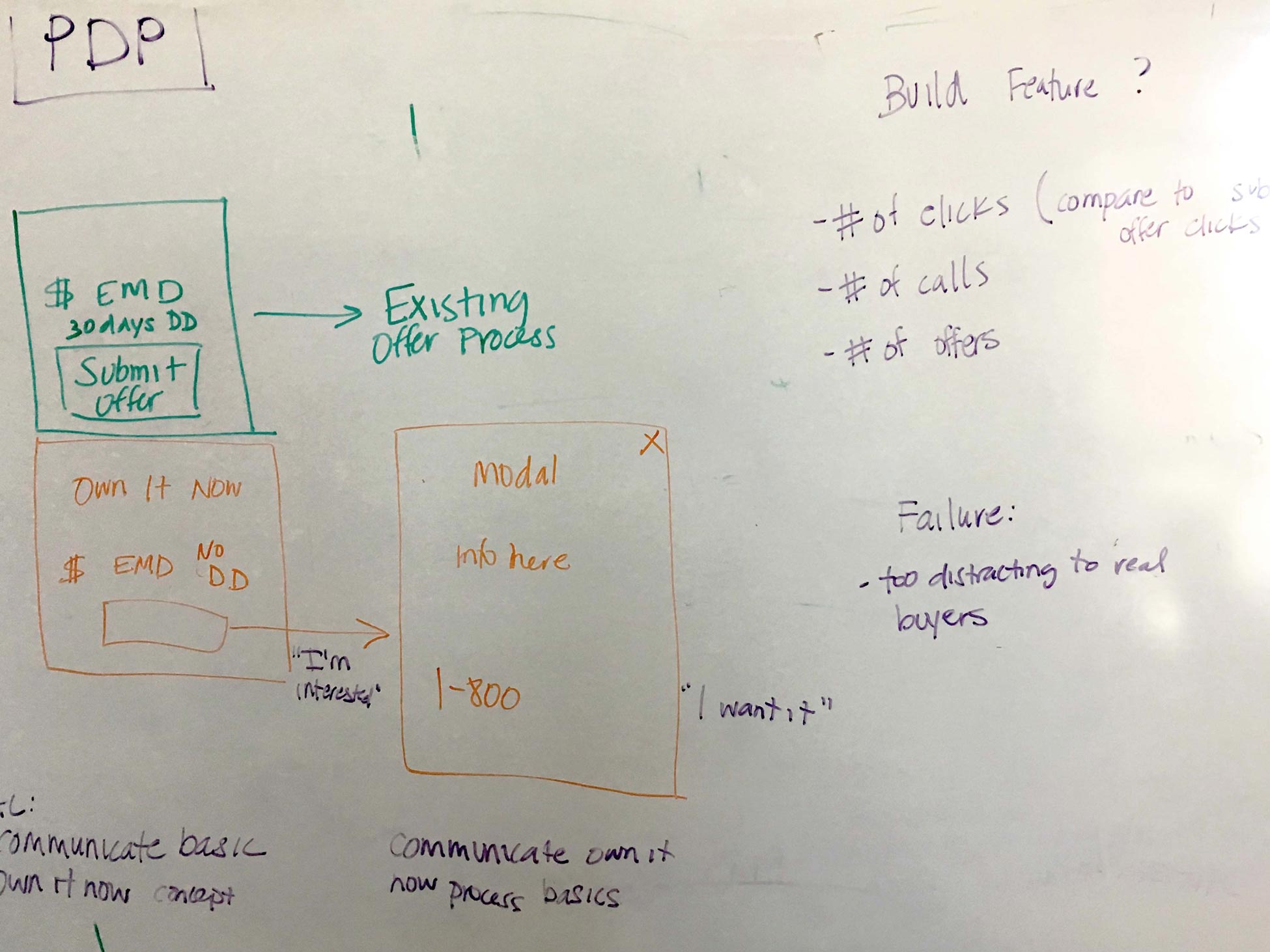
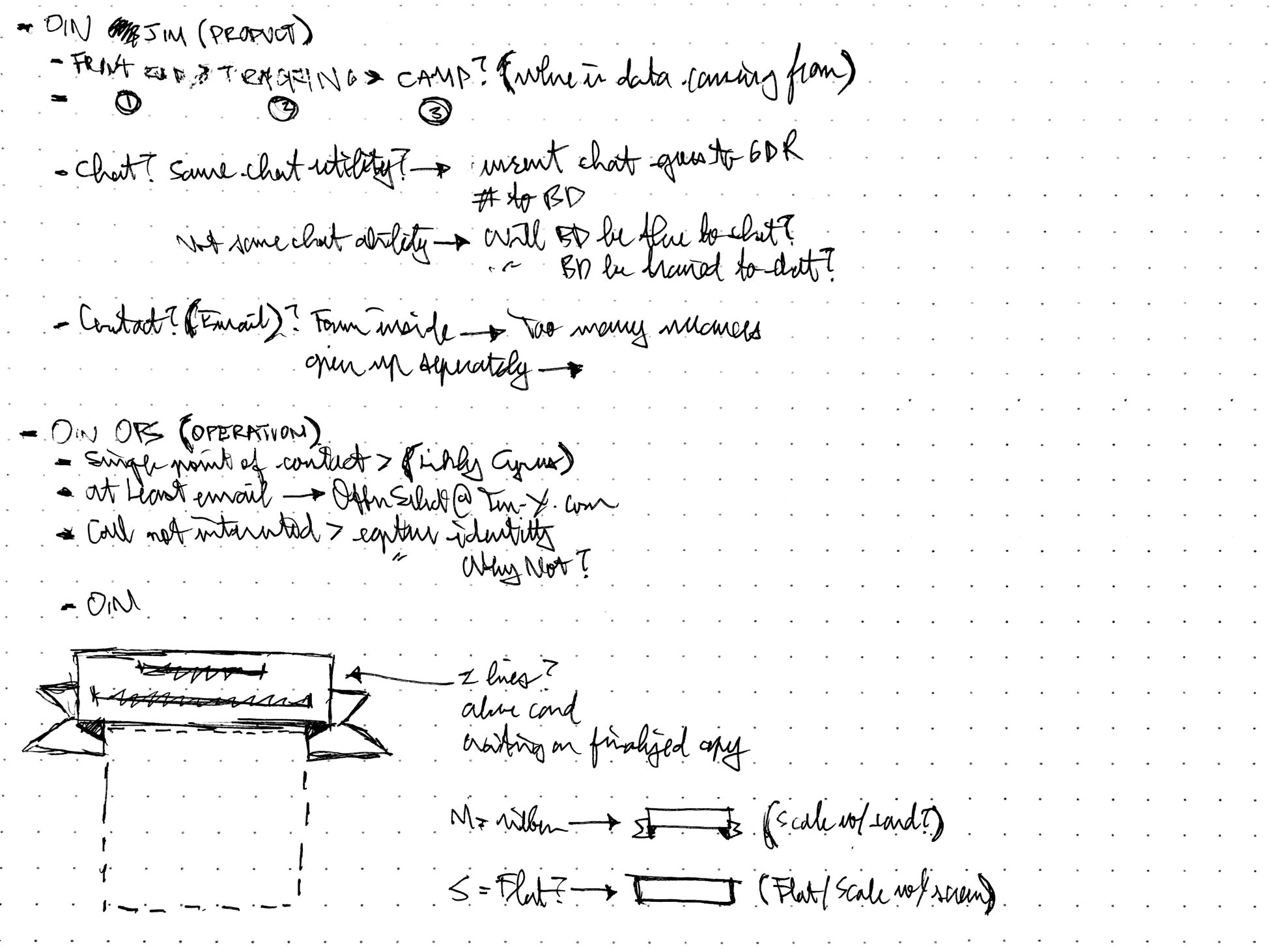
I began by whiteboarding and ideating user goals, needs, constraints with my team.
I sketched early UI, UX explorations and potential interaction designs.
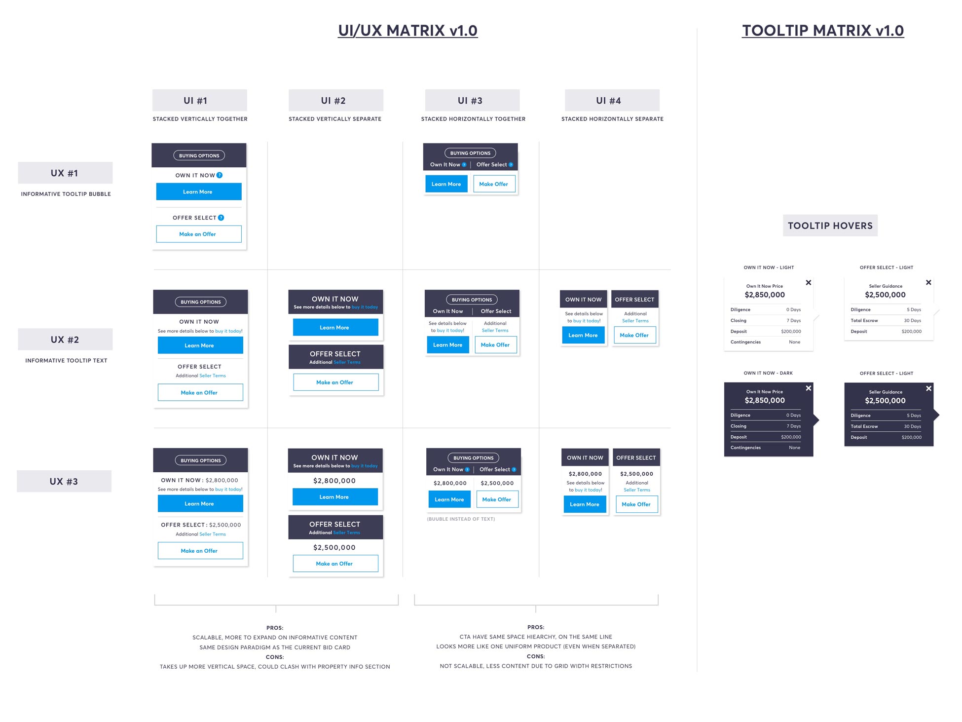
I then created high fidelity UX/UI matrix for team feedback and revisions.
I also created various high fidelity design UX/UI & visual treatments for stakeholder feedback.
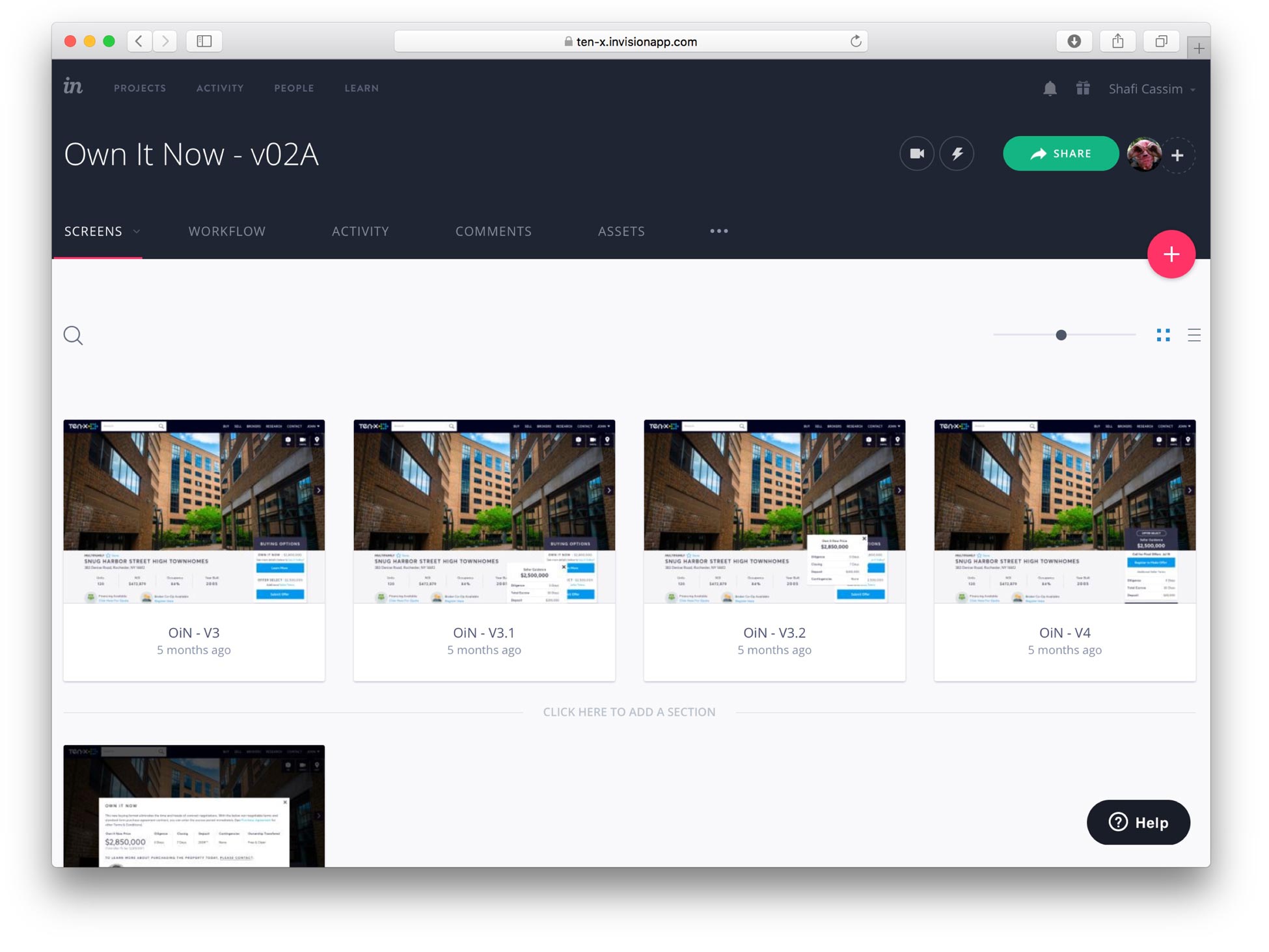
I created a lightweight prototype through inVision to expedite quicker internal feedback.
I took the the internal feedback and created user tasks to test and gather actual live user feedback (working closely with the CX team).
RESPONSIBILITIES
- Research
- UX
- UI
- Visual Design
WHAT IS IT?
Own It Now is a new purchasing process (trademark pending) that offer buyers the ability to quickly close and own an asset rather than go through the typical lengthy offline negotiating terms.
The value proposition to the product is that, traditionally, this process is impossible offline. Real Estate, commercial real estate particularly, is an always negotiable and heavy diligence process. What Own It Now brings to the table is the ability to close the deal as is based on a set of clear terms (contingencies).
WHAT IS THE PROBLEM WE'RE TRYING TO SOLVE?
The concept of Own It Now is a passion project from our new General Manager, who is very adamant about building this product. This proposes stakeholder management challenges as objectivity can sometimes be skewed. From a product perspective, what we’re trying to validate as early as possible is, is their actual public user interest in the product? Rather than spend millions of dollars in company resources and time for a product that may not provide a user need, we decided to build a very slim product to test our hypothesis. By using a very lean UX methodology, we incorporated the following process:
- Quick feedback loops
- Rapid design iterations
- Early user testing
- Very lean dev cycle
WHO IS IT FOR?
We are working under two hypothesis as to whom the audience for this product is for:
- “1031” Buyers – These are users who recently sold commercial real estate and are under a strict timeline to re-purchase a property quickly in order to avoid tax implications. They are motivated buyers and handicapped by time.
- First Time Buyers – Commercial real estate is not a transparent game, most desirable offline purchases are done with brokers who are selective with clients. This process eliminates any biases, it’s a “first come first serve” policy.
WHAT IS THE PROCESS & GOAL?
By saying lean, I mean really lean. Our goal was to go from research, designs, iterations, user testing and development within two sprints (2 weeks each). This was also with a small team (1 designer, 1 product manager, 1 user researcher and 1 developer) whom we’re all dedicated on other products with tight deadlines as well.
Sprint 1
- Week 1 – Research sessions (whiteboarding, sketching, team feedback)
- Week 2 – High fidelity designs & prototype (sketching, re-iterating, team feedback)
Sprint 2
- Week 3 – Live user research feedback & dev framework (sketching, re-iterating, user and team feedback)
- Week 4 – Development & QA (no QA engineer, designer does quality assurance once pushed onto the DEV environment)
CONCLUSION
We were able to quickly release an MVP feature without having to invest months and millions of dollars of company time & resources building out a full fledge product. We build a test feature, and now can measure and learn. The test feature has gone live into production as of Q2 of 2017. The operations team was able to secure a real life asset (a Burger King in Phoenix, AZ) to have the Own It Now feature tested. This helped tremendously in validating some of our hypotheses about the product.

