
Portfolio Categories: Product Design
Auction / TenX Rebrand
FINAL PRODUCT
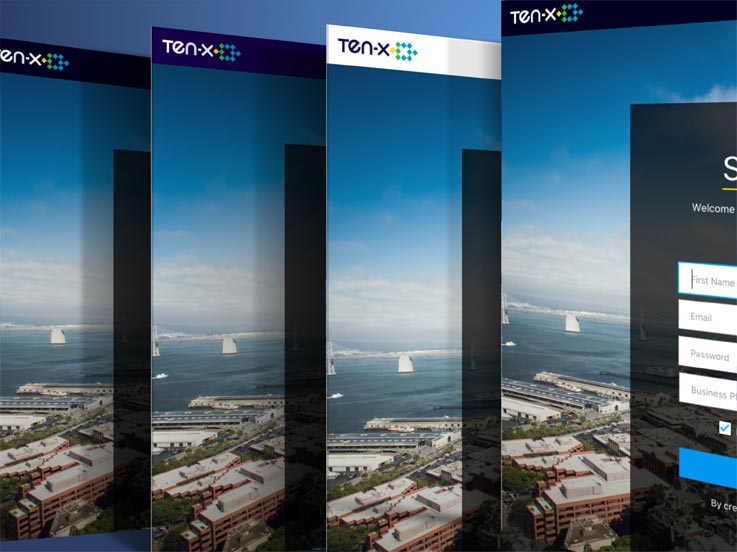
Final Branding Direction

Mood Board

I began creating various color explorations for the future product

I inserted the final visual directions into actual product pages like the homepage/landing.

I also applied the final visuals into multiple search results pages as well as responsive variations.


I created various use case explorations of the new navigation & interaction features.

I also did various high level potential future product pages explorations.

RESPONSIBILITIES
- Marketing
- UX
- UI
- Visual
WHAT IS THE PROBLEM?
Auction.com is a very successful online real estate platform with its closest competitor owning only about 8% of the marketshare. Auction.com was essentially broken down into 3 lines of business,
- Wholesale (foreclosure, bank owned, etc)
- Homes (consumer to consumer)
- Commercial (investors & consumers)
The major source of the company’s revenue and success has unequivocally been the Wholesale business. The wholesale business although profitable, brought along a major stigma; distress. During customer research session, approximately 75% of consumers associated Auction.com with key words such as bargain, cheap, budget, etc.
All 3 lines of business being all under one umbrella was problematic as their wholesale business dragged that stigma along to the other two lines of business (Commercial & Homes). With the efforts of our Chief Marketing Officer, Auction.com began a year long process of rebranding the business.
WHAT IS THE GOAL?
The goal was to break the single umbrella that held all 3 lines of business and give each business a chance to be a self sustaining individualistic product. It also was important to eliminate the stigma of bargain properties to be associated to commercial real estate product or consumer home product. It was important to change consumer perception of the business as they wanted sophistication and quality to be associated with the others lines.
WHAT IS THE CHALLENGE?
To speak honestly, this was one of the toughest projects I’d embarked on at Ten-X. I was tasked by the director of design to be the designer in charge of the product side of the rebranding. The CMO at the time was adamant about keeping everything in secrecy, even within the company itself. This meant that even within my own product and design team, I was told not to mention any of the process and even forced to sign a non disclosure agreement for entirety of the project.
The project started off bumpy as Marketing made no effort to bring Product into the process for feedback or concerns. The Marketing team hired an outside agency to do the company logo and colors. In the end, I was shown a deck and then handed some logos and font they wanted to use.
Problem was that everything they did for print & marketing did not translate over web & product. The colors were not good for accessibility (not readable on screen) and the font was not web safe (breaking across browsers). When I was able to give feedback, the Marketing team had to go back to the branding agencies and address all Product concerns. This was a very time consuming and an expensive mistake that could have been avoided through early communication and feedback.
WHAT IS THE PROCESS?
The process really had two silos. There was the technical process (how to convey to the developers) and actual visual design process (using marketing guidelines and visual design philosophies). Below I will describe both processes as simply as possible.
Process For Development
The process from the product design side was very meticulous. Myself and the lead front end developer worked closely together and gave a detailed outline to the director of design. A basic breakdown of the plan was as followed:
- Assess all current Styleguide & Toolkit components and making a list of all product pages that use Toolkit components. This includes going over all Page Building Blocks, Navigation, Container and Layout, etc.
- Assess every Auction.com Toolkit product pages to make sure that nothing is broken in the process.
- Loosely take a current product page (we used the Search Page for this exercise) with Toolkit components and break down which parts exist in the current Styleguide and what needs to be added.
At the end of this process, we wanted to have completed:
- A theming system for the Toolkit (one Toolkit for all 3 lines of business sharing all the same components and but with each line of business having its own visual/pattern guidelines or theme)
- An adjusted Auction.com theme based on the new theming system.
- A Ten-X theme based on the new theming system.
- A Search Results Page (the one product we chose as the test for delivering) wireframe that will convey to developers how to bring the bring the Search Results Page into the various themes we were creating using the Toolkit.
Process for Visual Design
The branding agency had given product a brand ethos (marketing elevator pitch) to give us a feel for the direction they wanted to head towards. I then had to translate this into a visual design philosophy to pass on to the design team. The key descriptive terms for the product visual direction were as followed:
- Sleek
- Refined
- Sharp
- Sophisticated
- Minimal
The visual design goals were:
- Maintain a clear Ten-X brand
- Have a clear distinction between the different Ten-X products
- Appeal to the key demographic and eliminate the stigma with Auction.com
The differentiators and decisions I was trying to re-solve during the visual design process was which direction was the new product efforts going to take.
- Light vs Dark?
- Dense vs Spacious?
- Familiar vs Progressive?
This process itself was very lean. There was multiple design feedback sessions with the design and product team as well as communication with key stakeholders (primarily C-Suite) for feedback about the direction the product was heading.
CONCLUSION
The re-branding itself from a technical point was a success. There were a lot of midnight hours the last 2 weeks (with free catered company dinners) but we were able to release the company rebrand successfully at the end Q1 2016. The CX (customer experience) team went back at the end of Q1 2017 to assimilate the now separate lines of business, and customer feedback was quite positive. Commercial Real Estate and Consumer Homes under the Ten-X umbrella product no longer carried the negative stigma associated with Auction.com and successfully distinguished the products from one another.
Customer Journey Map
FINAL PRODUCT
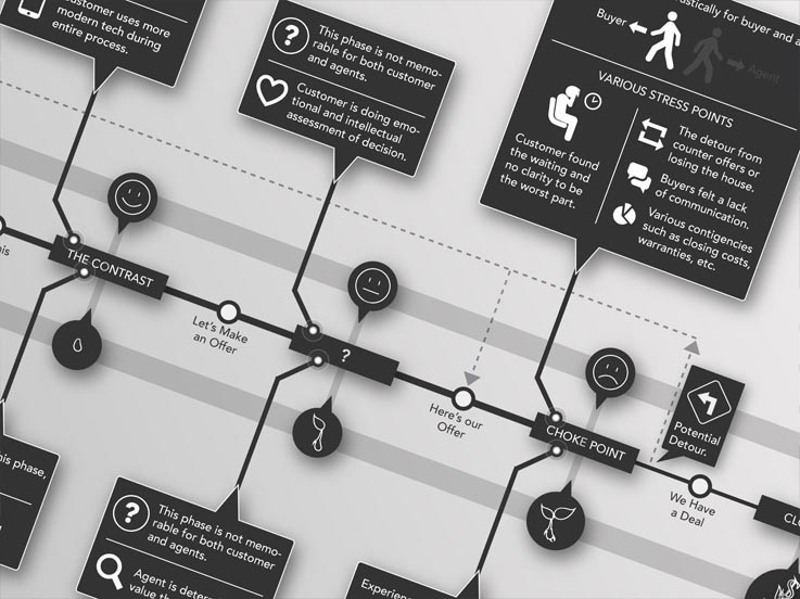
Full Customer Journey Map

I began whiteboarding concepts with the Director of Design and VP of User Experience.


I sketched a lot of journey variations.


I created storyboards, scripts & sketches for the marketing promo video.


I helped facilitate focus groups sessions and whiteboard notes.


I created early concepts for the buyer/seller journey retail flows.

RESPONSIBILITIES
- Research
- Visual Design
WHAT IS IT?
This was a research project led by the VP of Customer Experience who would go on to eventually patent a concept that was essentially a “buy-it-now” for the consumer to consumer business. But before it could get to that point, we had to convince the board that this was a worthwhile product. Part of the conveying process was to have a visually communicated Customer Journey Map, along with research findings, to present to the board.
WHAT IS THE PROBLEM?
The problem is that buying a home can be a very arduous and often stressful & tedious process. Both sides of the home purchasing journey goes through various and definitive pain points.
WHAT IS THE GOAL?
Our goal was to identify, understand and potentially resolve these pain points through a product that could help facilitate this process using our online platform.
WHAT IS THE CHALLENGE?
One of the major challenges we hit right away was how jaded the Bay Area housing market was. Having a house sell well beyond the asking price as well as having bidding wars with 10 other potential home buyers was not a common occurrence around the country. The Bay Area was an anomaly and we knew in order to get more reasonable feedback, we had to do our focus group sessions outside of California. The area we focused was Las Vegas Nevada because of their quickly expanding consumer market and more reasonably diverse middle class. We needed to clearly identify within our research if there really was a need for a product like this in the market.
WHAT IS THE PROCESS?
We outlined and began a lengthy research process. Process work that arose from the customer and user experience studies for the Customer Journey Map and eventual products were,
- Whiteboard Brainstorming Sessions
- Use Case Storyboarding including:
- Scripts
- Storyboards
- Video marketing promo
- Multiple detailed focus group sessions with:
- Home Buyers who purchased property in the past year
- Agents & Brokers who’ve sold property in the past year
- Early concept of Retail Flowchart for Product
- Sketching and Ideation of Journey Map including:
- Notebook sketches & concepts
- Early Map variations (for feedback & updates)
- Final Visual Customer Journey Map
This entire process would eventually lead to the Unsealed Bid beta, Offer Select and Own-It-Now Product for Ten-X.
CONCLUSION
The Customer Journey Map when completed was printed largely and hung outside the main meeting room in order to begin conversations and illicit feedback from anyone within Ten-X. It helped to facilitate conversations and in the end and the board agreed to fund the project. However, during the rebranding, the product was dropped for the consumer business. The research however did not go to waste, as it was the initial data that began the process for products on the commercial side named Offer Select and importantly, into my flagship product and commercial real estate equivalent Own-It-Now.
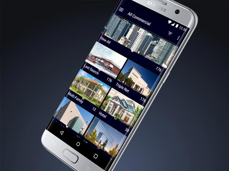
Auction Search Results Table View
FINAL PRODUCT
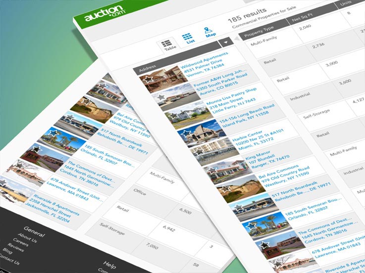
Search Results Table View

I interviewed users and gathered notes of CRE user data consumption (i.e. Excel)

I began ideating & sketching variations of the table designs UX and interactions.

I created redline deliverables & handoffs for engineers to implement.

RESPONSIBILITIES
- Research
- UX
- UI
- Visual
WHAT IS IT?
The Table View within the Search Results Page is a product that derived based on customer behavior and user feedback. It is feature that was added to the Search Results Page well after the initial release of the list, grid and map views, which are all more typical views associated with search results.
WHAT IS THE PROBLEM?
The problem was that the initial Search Results Pages were initially designed for the residential and wholesale business. Its search behaviors fit that particular customer and user base. However, when dealing with the commercial business, the Commercial Real Estate users browse and absorb data very differently. As a result, we needed to cater an experience more adapted to the commercial real estate users. It was brought up to myself and my director by our Commercial Product Strategist at the time that we needed to design an optimized search result for these users.
WHAT IS THE CHALLENGE?
When we did you user research, we noticed that the commercial real estate investors were an older mentality group of users. Although the majority of them did own smart phones, they still did their primary searching on a desktop or laptop computer. They would often print out SRP (search result pages) and PDP (product detail pages) and copy and paste property information into excel spreadsheets. This was the way the majority of particular group absorbed the CRE (commercial real estate) data.
WHAT IS THE GOAL?
The goal is to aid the commercial users by helping them gather the information quickly and efficiently. We wanted users to be able to gather the information from the search results page they deemed necessary in order to be able to view multiple potential properties, without having to dig through the PDP for it. Based on user research we did prior to the designing the product, we observed and gathered feedback on how this particular user group browsed and absorbed data; It was important to help eliminate any bounce rate from the search results page.
WHAT IS THE PROCESS?
This product, from research to development, was done in about one quarter with a small team (all working on different products). We did not have any official sprints or stand ups, we all worked organically and self-accountably.
Sprint 1
- Worked with Product Strategist and Director to identify user pain points and understand bigger picture items
- Began work with the Customer Experience team to bring in users for user research feedback
Sprint 2
- Early wireframe designs with UX/UI concepts
- Prototyped wireframes in inVision and and tested internally for quick feedback
Sprint 3
- High fidelity designs
- Worked with prototyper (we had a front end prototyper at the time) for a fully interactive high fidelity interactive prototype
Sprint 4
- Test prototype with live users for feedback
- Gathered user feedback and begin design updates
- Worked with Toolkit team to begin additions of new components and patterns (tables & interactions)
Sprint 5
- Finish all final visuals and deliverables for Styleguide & Toolkit (to make all components ready for future designers and developers)
- Finish all redlines and deliverables for front end developer (work next to the developer to make myself accessible 100%) as development begins
Sprint 6
- Development continues (I remain assessable for feedback, guidelines, etc)
Sprint 7
- Ready for QA in our our dev testing environment
- Work with QA (remaining accessible for feedback, etc)
Sprint 8
- Product goes into production (watch closely for any minor or major bugs)
CONCLUSION
In the end, I designed a product that was intended to give the users the feel of their familiar spreadsheet, but with an efficient user experience and interface. We A/B tested the product and let 50% of the users have the table view as the default SRP landing experience, while still landing the other 50% of the users on the grid view but with a tooltip indicating that a new view was available. After several months, 92% (source: omniture) of the commercial users preferred and browsed in the Table View. The product was deemed very successful by the business and the small team received internal recognition for taking initiative and identifying a hole in the product. It was done quickly and inexpensively. I would deem this particular product feature successful as it was 1) one of the early passion products by a few motivated individuals 2) and was officially flipped over as the default Search Results Page view after a few months of testing.
Auction iOS App
FINAL PRODUCT
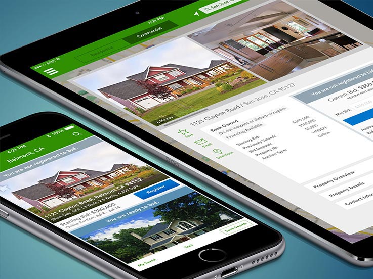
iPhone & iPad iOS Auction.com Apps

I began by whiteboarding user journeys, needs, goals and constraints with my PM.


I sketched and ideated notes, assumptions & sketched early UX/UIs.


I created various static visuals wireframes & shared it with the team.

I gathered team feedback, and revised bidding logic, visuals, etc.

I created the high fidelity visual designs (iPhone dashboard variations)

I created high fidelity visual designs (iPhone SRP, PDP & bidding variations)

I also created the final high fidelity visual designs for the iPad.


RESPONSIBILITIES
- UI
- UX
- Visual
WHAT IS IT?
The Auction.com mobile IOS apps.
WHAT IS THE PROBLEM?
At this juncture if Auction.com, the company had a successful online presence without a mobile phone product. The business had an iPad app that had gone out on beta and developed a little bit of traction, but no iPhone app. The metrics for the mobile web on the iPhone showed usage trending upwards month after month. As a product team, this led us to begin the process of building an official iOS mobile app that would serve both iPhone and iPad.
WHAT IS THE GOAL?
The longterm vision and goal was to have users be able to bid, browse and win properties on a portable handheld device. The short term goal was to release an MVP product to get into user hands in order to measure and learn quickly from user behaviors.
WHAT IS THE CHALLENGE?
There were two major challenges right off the bat for the mobile iOS app.
1) Lack of Resources
- At the time we had a very small team, one Product Manager, one Developer and one Designer (myself). Auction.com was in its product infancy (the product team itself was less than a year old when I joined). We definitely lacked resources and the business still considered venturing into mobile, at the time, to be futile.
2) Design Methodologies
- The biggest change in terms of UX and UI was leaving skeuomorphism and entering more traditional modern design methodologies. This added more challenges as our user personas showed an older user base who were not fond of big changes. On top of all this, another challenge was having to learn update myself with the new visual, patterns and processes of the evolving iOS designs.
WHAT IS THE PROCESS?
This was one of my first major products at Ten-X and I was fortunate enough to work with a very strong Product Manager. She handled all the business and stakeholder challenges so I as able to focus more on design problems (UX, UI and visual designs). We broke down the the design process as such,
UX (User Experience)
- The PM and I locked ourselves in a room for several hours and essentially worked on the discovery phase. We went straight to whiteboarding and breaking down the current iOS 6 app. We discussed how much could be salvaged (it wasn’t using the same code base at the moment and was coded by a contractor that had since left). The biggest factor being the current iOS 6 iPad app was ONLY a browsing app, it did not allow bidding. We discussed technical use case scenarios that could happen (how the API would handle multiple mobile bids if the behavior didn’t exist for the desktop etc). We broke things down using matrixes and began a rough idea of what we expected, and how robust the experience could or should be for the first release. During this time, I also spent a lot of my work and personal time catching up with Apple’s pre flat design developer guideline and documentation.
UI (User Interface)
- After the discovery phase, I began to sketch many user interfaces based on our UX discussions. I did a couple of wireframes and presented to my PM. We worked through all of them and edited designs till we felt the product was moving in the right direction. I then created high fidelity designs and prototype for us to test internally. After a last round of internal feedback, I began the final flat design visual designs for handoffs.
Visuals (final assets and deliverables for development)
- This is the only part of the design process that I spent in my own “bubble” making sure all redline details were correct, especially regarding grids and adaptive sizes (responsive design was not even something in our scope). During this implementation phase, I worked closely with the developer to make sure that there were no issues with my handoffs and that I’d be completely available for any questions or feedback he had regarding the user experience, user interface or final visual designs.
CONCLUSION
Amazingly, the iOS product launched within a very tight time frame and deadline. Since the release of the initial iOS7 app, the Auction.com mobile app has grown tremendously. Mobile has continued to trend upwards and as of January 2017, handled close to 35% of Auction.com’s bids. The mobile team itself has grown tremendously, with now 3 separate mobile teams (Residential, Commercial and Wholesale) all consisting of their own PMs, designers, and several developers each.
TenX Android App
FINAL PRODUCT
MVP Android App

I created digital & physical flow chart of full MVP app (Project & Product Management).

I did a digital breakdown of all critical and major issues (Project & Product Management).

I made physical print outs of product flows for facilitation of daily stand-ups and communication (Project & Product Management).

RESPONSIBILITIES
- Project Management
- Product Management
- UI (minimal, adding and removing features)
WHAT IS IT?
The Ten-X mobile Android app.
WHAT IS THE PROBLEM?
Ten-X has had a successful mobile CRE (commercial real estate) iOS app but over a year at point that had developed fairly good traction. When observing the mobile web metrics, it showed a fairly even split down the middle (54% iOS to 46% Android). It was becoming quite apparent that we were alienating about half of our mobile users by not having an Android version of the app.
WHAT IS THE GOAL?
The goal is to pick up on that missing 50% android mobile user base and release at least a parallel MVP CRE Android app by Q2 of 2017.
WHAT IS THE CHALLENGE?
This is perhaps the biggest loaded question of the product. I was not the initial designer on this product. I had no input on the UX, UI interactions or final visual designs. My design work extended only to minor UI work when new features were added or previous features needed to be edited or eliminated all together. The challenges of this project ran so deep that most of my work came in the form of Product Management and Project Management. This app essentially took on all the UX/UI of the iOS app combined with the paradigms of the Android operating system.
This app had been dragging and was on borrowed resources. When I joined, the developer on the project was a contractor, the QA was also a contractor, the team did not have a dedicated Product Manager, no Project Manager and certainly not a Product Owner. We had an infuriated Director of Engineering who essentially came to that team and said he was loaning them 2 extra developers to hit the Q2 2017 deadline, otherwise he was shutting down the product and dismembering the team. That’s when I was brought in to this project by my design manager at the time to essentially do what I call, clean up work.
The team has no processes, no stand ups, no physical communication (only spoke to each other through slack and Jira tickets) and a running backlog of hundreds of major and minor tickets as well as no project manager to keep the team in check. This was easily, the most chaotic product I’d worked on during my time at Ten-X.
WHAT IS THE PROCESS?
I had to take several steps back in order to approach this project properly. Every problem had been quite unique with each particular product I’d worked on at Ten-X. The way I approached this product was like this,
- Product Management & Project Management
When I entered the project, a temporary Product Manager was also assigned that same Sprint. Their knowledge of the product was only as deep as mine as we were all brought in rather late. We sat in a room together and spent hours going through the hundreds of tickets. We started a basic task management and clean up, we deleted duplicate issues, backlogged or pushed back low priority items, prioritized tasks, etc. As Product Designer, being part of every aspect outside of the typical UX, UI, interaction and Visual design was not uncommon. I was often there during research, stakeholder management and product planning, etc. We then forced a mandatory daily stand up and weekly backlog grooming, retrospectives at the end of sprints all while enforcing physical-in-person-communication.
- Communication and Facilitation
From our very first stand up, I realized quickly there was no proper communication. The lead contract engineer was this older gentlemen who refused to address issues in person, only yelling ticket numbers (in a backlog of hundreds) and telling QA and everyone else just to “file a ticket and assign it” to him. I didn’t feel the PM was facilitating the issue in a way that was productive for the whole team so I respectfully asked to help facilitate (which he happily accepted). I created a giant 8ft tall print out of the entire Android architecture and made a visual representation of all the tasks. I brought the board to stand up the next day and rather have people yell out numbers, I had people ago up and point at which feature it related to (Search? PDP? Dashboard? Etc) and update the board using Post-Its. This presented a clear visual aid and helped to ease communication. I would created high fidelity flows and prototypes to show during our retrospective to give a visual sense of our accomplishments, no matter how small. The biggest challenge for the product in my opinion, was building team morale.
- Design
As I’d mention above, in addition to the tasks we had as the Android mobile team, we also had to make sure that everything ran parallel with the CRE business. Whenever new features were added in other parts of the business, we quickly scrambled to prioritize it the for our sprints (full on big products, we redirected to the mobile web view for the MVP product) so that we could scope properly and still make our estimated time of delivery. I would do all designs and handoffs based on the priority log. This was especially difficult because I also worked on multiple other products and was also in two other sprint teams, as well as the styleguide team and design team committee.
CONCLUSION
Although chaotic, the Android team was able to complete the MVP app. We did a slow release internally first to allow stakeholders and customer service reps to get acquainted with the app. We then worked closely with the marketing team to help develop a release plan for the public.